< < <
My paintings "Under Northern Skies" and "The Teaching Rocks" became
lmited edition prints in the early 1990's but the original public
excitement about wildlife limited editions was lessening..We have to
admit that the limited edition reproduction was a new thing - allowing
anyone to have a highly illustrative nature image on their wall. But
when everyone had decorated their walls and there was no more space
left, they had no reason to buy more. The limited edition print
phenomenon was not one that regenerated itself regularly like popular
music and film. There was and is no culture of 'hits' motivating people
to replace their old prints with the new 'hits'. So many people loved
my prints but said 'our walls are full'. It was not
economic for me to pour money and energy into making and marketing
prints. I never enjoyed the marketing side of it anyway.I would rather
just create the art. I however kept my prints, and continued
to deal with them as circumstances allowed, carrying them alongside my
regular art. I returned to only creating original art. Still, I could
not
create large serious paintings that took weeks or months and had to be
sold for thousands of dollars - there simply weren't many wealthy art
collectors!. But I found great
interest - as always - in my quick small 8"x10" landscape paintings of
the kind that goes back to my teenage years. Public interest in them
has never wavered. This then became my new bread-and-butter, while
continuing to also make serious large paintings and hoping to
find buyers for them. This Part 3, covering 1995-2005 (more or less)
will present some of the larger landscapes, and plenty of the small
landscapes .
I found additional income in website
design. With a commercial art and advertising background going back to
1968, I was preadapted to take on both traditional brochure and
advertising design, and the new website design as the internet and
worldwide web emerged in the late 1990's. I was excited by the creative
opportunities and learned html and javascript coding (There was no easy
web design software back then) Meanwhile, in my
spare time, I exploited the internet to both do
scholarly research. My researcj interests are rooted to when I was a
university student
and had an interest in the little-studied subject of the prehistory of
northern Europe..
From about 2002 I developed a theory of the prehistoric development of
boat peoples, who as whalers, spread around the arctic. This had
implications on linguistics too, as the aboriginal boat peoples were at
the origins of Finnic languages. This lead me to explore
what happened to the boat peoples who remained in Europe, which to me
were clearly peoples known historically as "Veneti" "Venedi" or
"Eneti". That lead me to decipher ancient Venetic inscriptions in
northern Italy - but that takes me now beyond 2005 and into my most
recent period. Another diversion was in fiction writing. Going back
to childhood when I tried to creat comic strips, I had a talent for
creating stories, so around this time too, I tried to write a novel.
(see
Abbi) In any event,
these research.and creative
pursuits were for my own interest, and gave me no monetary rewards.
Artistically, this period 1995-2005 were mainly about making selling
small landcapes, and trying to find customers for the more expensive
art. All along, I did sell my prints casually when people showed
interest, even though I no longer aggressively marketed them.
GREEN
BORDER AROUND IMAGE MEANS THE
ORIGINAL OF THE PAINTING
IS STILL AVAILABLE- CONTACT ME.
A WHITE
BORDER
MEANS SOME LIMITED EDITION PRINTS OF
THE IMAGE ARE AVAILABLE TO PURCHASE.
3.1
FINDING THE TRADITIONAL SOLIDITY TOWARDS LANDSCAPES
In Central Canada there is plenty of wilderness ot
the northern boreal kind, wilderness whose wildness and
healthiness cannot be found anywhere else in the world, other than the
least inhabited parts of northern Europe and Asia. Thanks to the
Canadian artists of the early 1900's, the Group of Seven, who sketched
and painted the Canadian wilderness, Canada has a tradition in art that
captures the essence of the
Canadian wilderness It is not that the public every
consciously wanted a tradition of landscape painting that did so - it
came about as a result of the prior North American interest in the
wilderness experience.
In the early 1800's as European culture expanded
into North America, interest developed in the Native peoples there. In
the mid 1800's the poet Henry Wadsworth Longfellow, created a poem
called "Hiawatha" which he based on legends and stories gathered by
Henry Schoolcraft, when he was among the Ojibwa in northern Lake
Michigan. By this time children were already making boys and arrows and
putting feathers in their hair as a result of the growing print media.
(Newspapers, then telegraphy, were spreading the news about the Native
"Indian" peoples), The poem "Hiawatha" and its author became extremely
popular on both sides of the Atlantic. Because of this popularity,along
with the development of railways, a tourist industry arose. Railway and
steamship companies began to promote tourist travel to various
locations from which they could experience the wilderness, complete
with "Indian" guides. One popular practice that city people sought, was
to be guided by an "Indian" guide to paddle canoes into Central
Ontario's lakes, to catch fish, and stop on a bank in midday to have a
"shore lunch" in which the Indian guide would fry up some fish they had
caught. They would then go back to the rustic lodge where they had
accomodation - unless they were adventurous and their Indian guide
guided them to camp through the night. Sportsmen of course were
adventurous, and went into the wilderness for many days and nights at a
time. In general, North America celebrated the wilderness. By the end
of the 1800's both Canada and America had created wilderness parks to
preserve the wilderenss and cater to this public interest in the
wilderenss experience.
Everyone who knows about the Canadian Group of
Seven, knows about their friend Tom Thomson (who died in a canoe
accident before the "Group of Seven" formed themselves). He hung out at
Ontario's Algonquin Park at a lodge there, and while he loved to take
excursions by canoe to fish etc, he also liked to capture his
experiences on small canvas panels. Note that at this time photography
was new - only huge cameras that took black and white - and recording
scenes in paint on small panels was the only way of capturing the
experience. That was the motive. Tom Thomson, or the other artists, who
formed a club to, together, go out into the wilderness and pursue this
practice of capturing what they saw on small panels. I believe that
when colour photography became simple in the last decades, especially
now with digital cameras, this motive of going on an adventure and
capturing it in images, would have been much less.
The point is that the "Group of Seven" began a
tradition of capturing the Canadian wild wilderness onto panels. As
they painted, they could do some organizing and design as required to
capture the feeling of a scene, but done in the outdoors, quickly, they
lacked the refinement of serious works of art. So the artists would
take some ideas from their small paintings, and develop them later in
the studio, resulting in the finished products that hang in art
galleries and art museums today.
The Art Establishment of the day turned up their
nose at the exhibitions by the "Group of Seven". By this time (around
1915 or so) the French impressionists were gaining popularity - those
were the Parisian artists who painted the scenery around the French
countryside with thick dabs of paint, to capture the feeling of the
scene. Everyone knows the name Van Gogh. He was one of the more
adventurous of them. The aritst of the "Group of Seven" did not imitate
the French impressionists, but simply wanted to capture the essence of
the Canadian wilderness - whatever artistic way that was achievable was
fair game: the ultimate purpose was to capture the scene in a way that
the viewer of it understood the subject matter, drawing from their own
experiences in the wilderness. These paintings were geared to
resonating with the North American wilderness experience that had begun
in the Victorian Age, and had resulted now in a wilderness tourism
industry with lodges, fish camps, canoe manufacturing, and wilderness
parks set aside by the governments.
The Art Establishment of Toronto - made up of men who
probably had never gone out into the wilderness - could not see the
relevance of depicting the wilderness in art. This was competely new.
The Art World of the time simply did not depict the raw wilderness.
Paintings should be of people, farm buildings, countrysides, vases of
flowers, gardens, streets, etc. Why would anyone want a painting of the
wilderness?!! The Art Establishment, being out of touch of the common
man who was now even going to their cottages in the wilderness in
summer, simply did not know what was happening, and that the general
public could relate to these paintings of the wilderness.
Art has always celebrated and reflected what the
general society was up to. But when elites develop to control the
valuing, production and selling of art, the general public changes and
values culture in their own unsophisticated ways.
Thus, to conclude, the 'Group of Seven' reflected
public trends towards the wilderness experience - first visiting lodges
and hiring "Indian" guides, and then actually getting their own
"cottages" and owning their own canoes and boats. Without knowing it,
when I grew up - my family going to the "cottage" beside the wilderness
every summer and even many weekends - I responded to the relevance of
painting the wilderness around me. And the proof of the relevance was
in my paintings of the scenery selling to other cottagers on my lake.
The capturing of the wilderness in art was not a formal new development
in the "Art World". It was simply a reflection of what the general
public was experiencing. When you experience the world in a particular
way, you want that experience to be captured and remembered.
And taking photographs was never enough.
I recall many times a customer
giving me a photograph and asking me to make a painting of it. Why not
blow the painting up to a framable size? The answer is simple - the
camera sees everything coming in the lens, from the suble imbalances of
forms, the intrusiveness of random branches and leaves, unwanted logs
and such in the water, etc. You can see this for yourself if you
compare the actual scene as the camera saw it with the painting. That
having been said, one in a hundres photos of scenes, taken by a
photographer with a good eye for design, actually look good. But the
artist can take a scene recorded in a poor photo, one that most people
would consider terrible, and extract a moving painting out of it. And I
have many examples.
I therefore found myself painting the wilderness,
for exactly the same reason that the 'Group of Seven' did, to capture
the scenery that the public was experiencing, and to which they could
relate. While the people a century ago who could relate to the Group of
Seven painting from their summer vacations going to lodges, camping in
wilderness parks, etc, by the 1960's my similar small paintings were
images which resonated with people who went regularly to their summer
cottages. This landscape painting was valued and purchased, and still
is, since going to the cottage is a strong as ever.
By the time the 'wildlife art' phenomenon developed
there has been another new experience in the general public - the
naturalist experience. There was since I went to school in the 1950's
and 1960's much conversation about endangered species. There was also
discussion of how nature worked. We all became naturalists in our
childhood. We liked to see not just the landscapes with which we
were familiar, but also the animals in those landscapes. While at the
time of the "Group of Seven" people were focused on their experience
while canoeing, etc., by the 1960's, we were more educated about
nature, and adding animals to scenes was like the cherry on top of a
sundae. In my paintings when I joined this new trend with wildlife, I
would often hide the animal in the landscape, and the viewer would look
at the painting as they would naturally experience it while canoing or
hiking, and then suddenly they see the animal in the painting and shout
"I see the osprey!" in the same way that they would actually encounter
an animal in the real experience. I believe my paintings are all
fundamentally in the Canadian Wilderness Landscape tradition, and that
my adding animals to the scenes is purely an extension of that,
completing the scene with expected wildlife, mirroring the experience
of the person in that landscape suddenly seeing an animal.
While I do have a portrait painting background that
can lead me sometimes on a path of portraying an animal - as opposed to
showing them as part of a landscape - my paintings in general are
in the Canadian tradition of
mirroring the Canadian experience of the wilderness, including
animals that naturally are found therein.
Yes, I will explore and experiment in other
directions, but my art is rooted in the Canadian experience of the
Canadian wilderness based on my own experience.
When the "craze" with limited edition reproductions
faded away in the 1990's, I still had the landscapes. Although I could
not make much money spending weeks and months on my landscape paintings
because there was no marketplace of wealthy people available from me, I
could still make hundreds of small landscape paintings and do them
quickly enough that they had a market among all people who went to a
"cottage" in Ontario, or went "camping' in our wilderness parks.
(Art critics who dismiss landscape painting, and
realism, must stop to think of what art is - art is a mirroring of
society. In prehistoric times, people were interested in bringing down
big game so they put images of them on their cave walls. In ancient
Greece, society was immersed in Greek mythology, so they painted and
sculpted images from mythology. In Christian Europe everything was
about the Bible, so murals depicted scenes from the Bible. In the
Renaissance, there was a return to Greek mythological themes, including
scenes from the Odyssey. Today, the cottaging and camping
experience in Canada is not paralleled in most other parts of the
world, and therefore viewers of my art from elsewhere than Central
Canada might have some difficulty relating to some scenes, the
size of the world public that understands and relates to the northern
boreal wilderness is substantial. That having been said, an argument
can be made that truly universal art uses the universal imagery that
everyone understands - sun, sky, land, foliage, the general shape of
trees, grasses, rocks, mammals in general, the human form. . If art
wants to appeal to all of humanity, then it tries to restrict itself to
what ALL humankind understands, and reflect their experience. There has
been a trend in art to either become specific to a culture (such as
Andy Warhols making a big deal of consumer products like soup cans), or
become extremely universal - such as "abstract" art analogous to what a
chimpanzee, our closest species relative, will create when given some
paints and paper: it is an indulgence with doing things with paint to
experience the psychological reaction. I can certainly see there is a
relevance in artists creating paintings that have the same effect on
chimpanzees and apes as humans, then the art becomes very universal,
comprising not just humans but our species relatives!)
3.2
PORTRAITS OF NATURE: TECHNIQUE
In the period 1995-2005 I did not abandon my limited
edition prints - since most of them are very saleable: I simply have to
frame them and present them to the buying public. But I realized the
trend was over. It was no longer possible to hand 50% of the
retail price over the the retailer. It was only practical if I was the
retailer. I could then even give a small discount. Accordingly I have
not stopped advertising my prints online and inviting purchases via the
internet - shipped via the postal system.
But by 1995, my energy was put into the landscapes.
While the small landcapes were the "liquid" product, I tried to keep up
my serious landscape paintings - mainly to show what I could do if not
constrained by the need to make a living.
The following presents some of the serious larger
work, and further below, a large number of examples of my small
landscapes.
MY
TECHNIQUE IN THE SMALL LANDSCAPES AND SERIOUS LARGE LANDSCAPES IS THE
SAME
But first it is important for me to show that even
when my landscapes are very detailed, they are STILL quite expressive.
While I don't deviate unnaturally from nature's colours, textures,
shapes, what I do is paint in ways that mirror what I am
painting. When I paint water in a scene, I use a brush long
bristles and very fluid paint, often as if I am painting with water
colour. If I paint rocks, I may make the paint thick, and perhaps use a
dry-brush technique to reflect the character of the rock. Similarly I
get emotionally involved in the object I am painting, and that emotion
is captured in the technique. It is a new approach to impressionism.
The colours and shapes remain true, so it still looks realistic, but
the surface of the painting, even when the detail is high, is infused
with the emotion of the technique guided by my reactions to what I am
painting.
Furthermore, my serious large paintings start out
being similar to my small paintings, and then I simply use thinner and
thinner brushes, never losing the technique. From a distance and in
photos, the technique is not visible, but the real painting up close
has a similar feel as the smaller paintings where the technique is
obvious.
The following painting is a good example
of my technique, here very visible on a small 8"x10" painting:
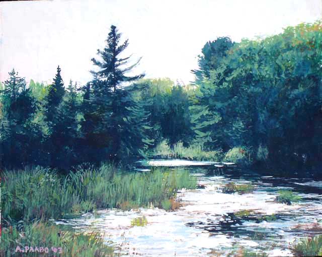
For
comparison, I show an example of an 8"x10" central portion of a large
48" x 36" painting.....
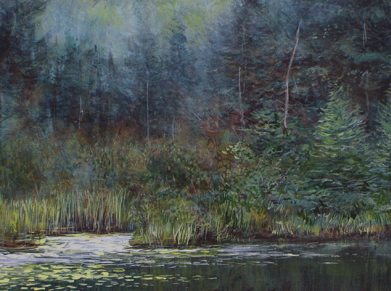
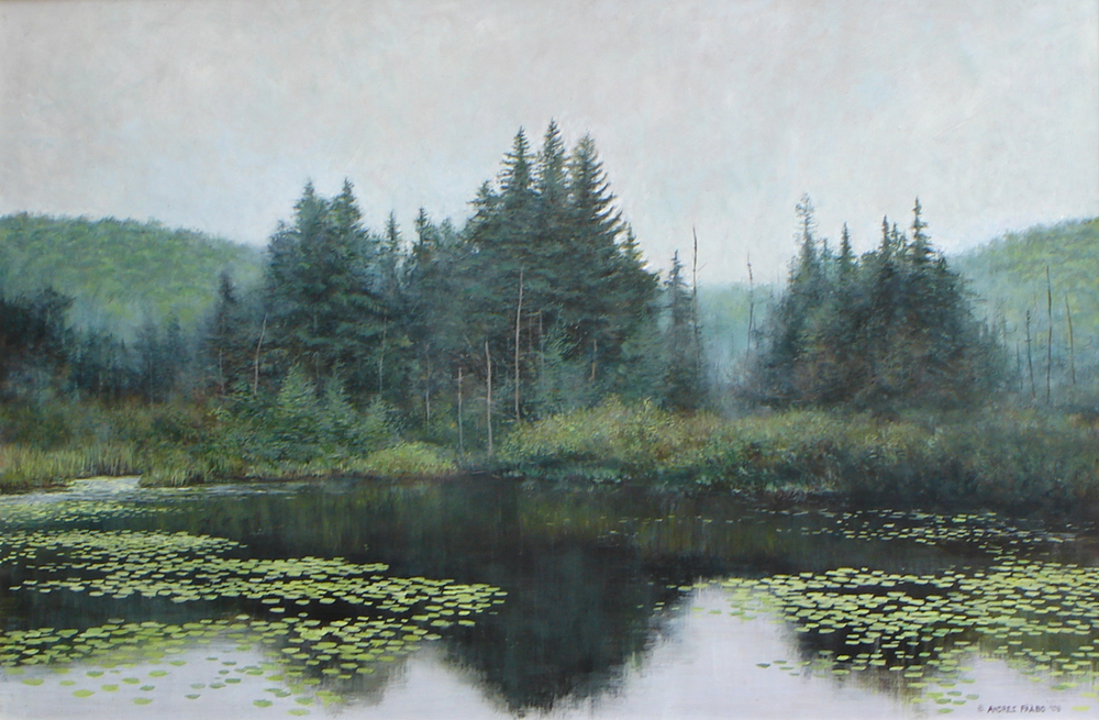
And yet, when photographed for this page,
you cannot see the nature of
the painting up close. That is why photos of my large paintings do not
do it the justice - the 'feeling' in the technique is lost in the long
distance view or photograph. (Painting
is Algonquin Pond #2 and is nearing completion and sale)
Therefore, do not be decieved when you see on these
pages photographs of large paintings that are in highly realistic
detail. If you see the actual painting, you will see that the technique
is the same as in the small paintings. The larger size simply covers
more canvas with the same technique. In real use of the large painting,
when on the wall, it is human nature to come quite close to it - say at
arm's length - since we are naturally drawn to detail. It is when one
gets close that the painting opens up and becomes quite
impressionistic
THE
ALGONQUIN POND SERIES
HOW
THE CREATION OF A LARGE PAINTING IS THE SAME AS FOR A SMALL PAINTING AS
WELL - ONLY THE BRUSHES BECOMES FINER AND FINER.
The following is the first painting called Algonquin
Pond. It so happened that I decided to record the entire process of
creating it. As you will see, first photos of the real place are a
little chaotic and off balance, but I can use it as a beginning point.
Then you will see that unlike many illustrative artist who develop the
painting, pencil it out, in advance, and then use the same small brush
throughout like a paint-by-number, I begin with a large brush, looking
for the design, trying to make the painting appear in my mind's eye in
advance. This is also the approach used by Robert Bateman. I believe
our methods are the same because we both began our art career trying to
emulate the Group of Seven and Tom Thomson with a technique that
"bang", started painting the scene right off without any finicky
predesign.
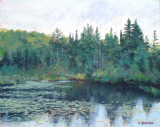
 ORIGINAL FIRST SMALL PAINTINGS
Two
small 8"x10" paintings of the
Algonquin Pond location. They became the jumping off point for the more
serious larger paintings below. I refer to these as well as photos of
the location that I originally took. My intention is to create a large
30"x20" painting but with the same level of detail - which results in
up close there being much more work in the foliage, grasses etc, where
in the small original much of it is blurry.
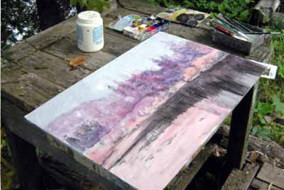
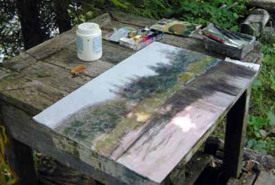
The painting begins by roughing it in using reddish colours that are
opposite to the greens that go on top.In the next period of work I am
adding greens and rough forms. It
is very loose and rough up close.
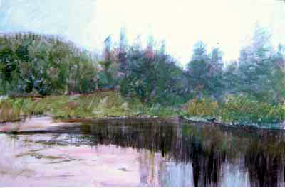
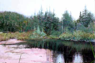
You
can see that I am beginning to develop the trees in the backgound to
give me more clarity as to how the background will look.
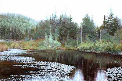
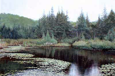
I now give attention to the
foreground pond with lilypads- lots of dots! The next period of
working on it, I do not like the trees in the background and blur them
for now. I work more detail into the background. Note I work no more
than 2-3 hours at a time, as the brain gets tired.
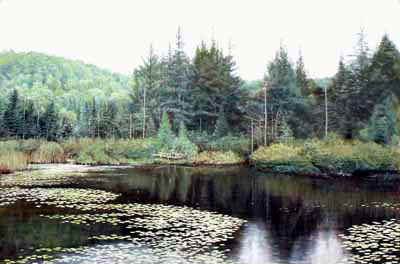
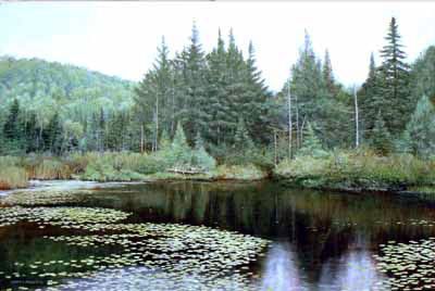
When
I return to work on the painting
I tackle the background trees in
the hill again and am more satisfied. I now have a good idea of where I
am headed. And then begins the many days and hours of making all the
elements in the painting very detailed, because it is designed so that
the viewer can study it quite close.
THE FINAL PAINTING
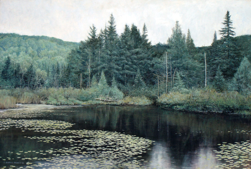
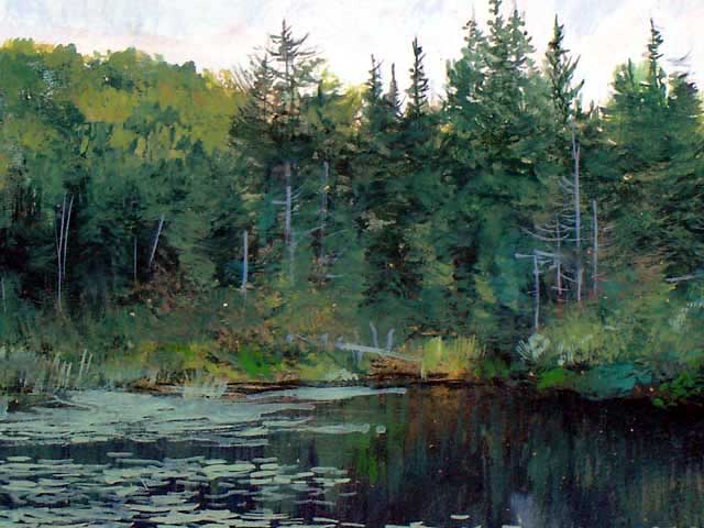
ALGONQUN POND 30"x20"
This
painting too is also a portrait of a location, because it describes the
location in detail. A portrait describes a specific subject but as in
human portraiture someone who does not know the subject matter, can
still relate to it.
MORE
PAINTINGS BASED ON THE SAME LOCATION
I continued to explore the subject, with two other paintings based on
the same location which I call Algonquin Pond #2 and #3.
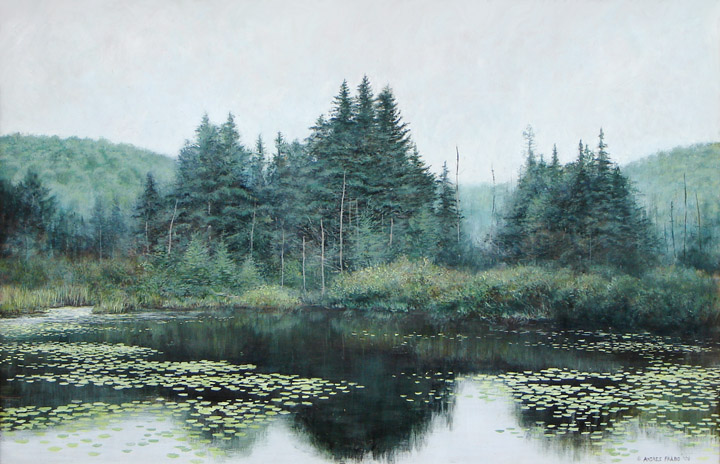
ALGONGUIN POND #2 48"x36"
Note
that this
painting is different from the original "Algonquin Pond" shown above.
But since the painting portrays the same location, if you did not
compare the two, you would think they are the same painting. But they
are just two paintings that happen to portray the same location.
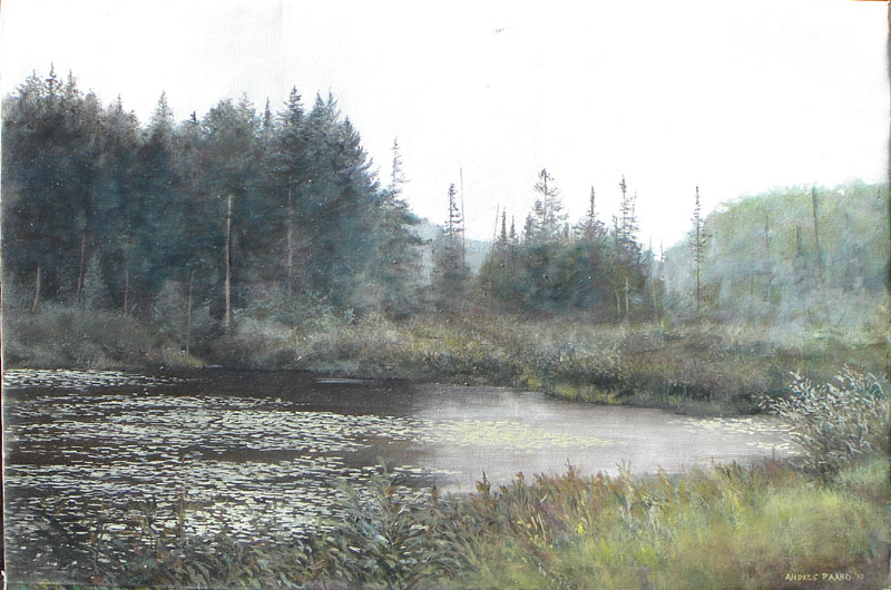
ALGONQUIN POND #3 48"x36"
This
version of Algonquin Pond is based on the region to the right (south),
and here I explored oil painting and impressionistic techniques
Note how this painting captures more of the "feeling" of a scene, while
#1 and #2 are more descriptive.
VARIATIONS
IN TECHNIQUE, SIZE, MEDIUM AND SURFACE
These three paintings are of the same location. Note how each
time I elect to use different techniques. Note too that I am not
committed to all details, but allow myself to change things in order to
arrive at a good design and impression.

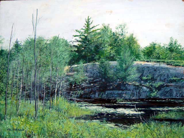
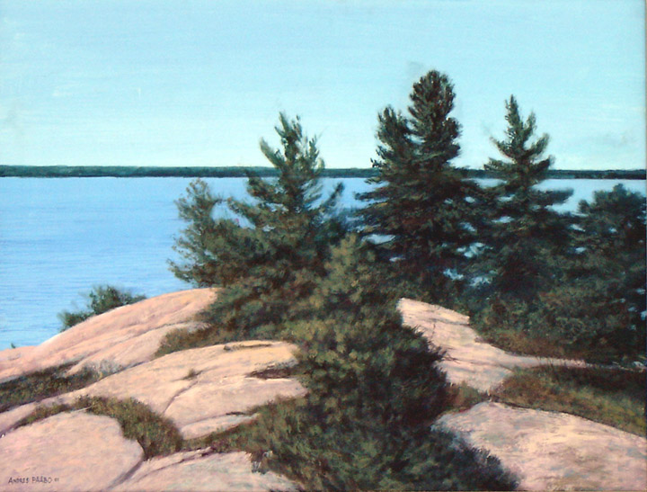
ROCK RIDGE - THE FIRST AND SECOND INTERPRETATIONS OF THE
LOCATION
These
paintings of generally the same location and subject,. began with the
small 8x10 painting to the left above, and later I created a larger
more organized version in 16x20 on the left. These lead to a rather
large painting on canvas shown below
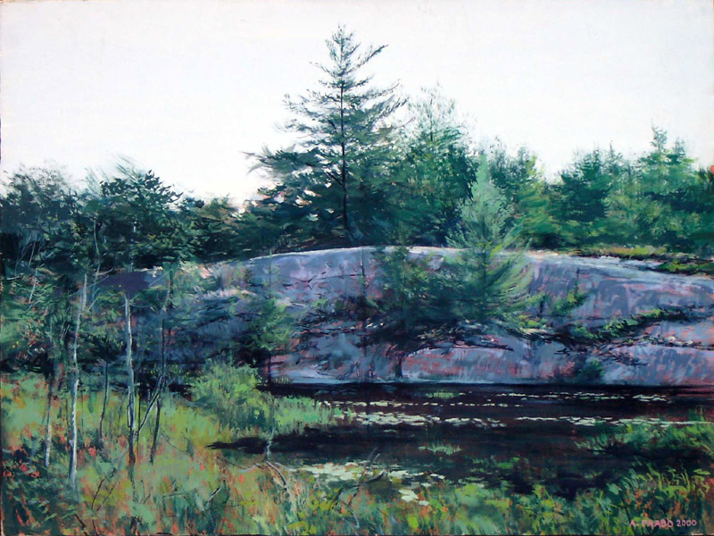
ROCK RIDGE, LARGE VERSION ON CANVAS 36"x24"
This
is not a "final version" because the two earlier ones are not intended
to progress towards this one. Rather all three are different approaches
to the same subject matter. What happens is that I find a location so
interesting that I need to explore it in further paintings.
EXAMPLE:
MY ART STRIVES TO SHOW WHAT THE HUMAN MIND PERCIEVES, NOT HOW THE
CAMERA SEES
The human mind
does not observe the
reality in the same way that a machine (ie a camera does). A camera
records everything that comes in the lens. That image does also come
through the lens of the eye and falls on the retina, but it is when
that image reaches the brain, that the brain filters, or sifts, the
image, to screen out what is intrusive and/or undesirable. The best
example would be a scene of a lake through a thicket of branches. Take
a photo of this scene, and you will see all the chaos of the branches
in the foreground. But that is not what you, the human remember about
the scene. The human mind will filter out the intrusive branches in the
foreground and see that nice scene in the distance. The human mind will
also overlook things being out of balance, even in the desirable part
in the distance. The artist in fact portrays the scene as the human
mind actually sees it, not in the imperfect way the lens of the camera
saw it. That is why photographs will never replace well-done art,
except where the photographer consciously captures just those scenes
that by chance happen to already be perfect. A wildlife photographer
typically has to take 1000 photos of an animal before by chance he
getsclear: both;
a shot that is perfectly designed. (The artist can take imperfect
photos and MAKE the perfect image from the imperfect source photos!) It
is also the reason for studio photography - the subject can be fully
arranged and lighted to be perfect for the camera.
The following painting is a vey good example of how
I greatly I can
improve on what is really there, what the camera sees, making the scene
look more like the human mind sees with its filtering and balancing.
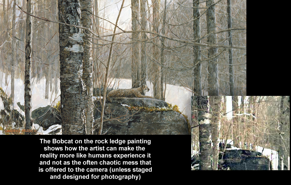
ROCK LEDGE WITH BOBCAT - AND A CAMERA VIEW OF THE ACTUAL
PAINTING.
Compare
the painting with the photograph to see what I have done - made the
trees more vertical, stretched the scene sideways for a more aesthetic
rectangle, made the branches follow simpler design - note how the
foreground branches are waves working together and integrating into the
abstract design. The original scene is full of chaotic randomness but
my mind's eye can see how, like a gardener, I can subtly rearrange
nature to look simpler, more powerful, and with a stronger abstract
design.
3.3
A SELECTION OF PORTRAITS OF NATURE (LARGER THAN 8" x 10")
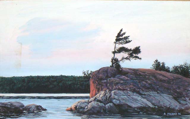
PICNIC ISLAND about 24" x 16"
'This
island is a central focus on Eels Lake, and called "Picnic Island". I
caught this amazing lighting in the later afternoon.
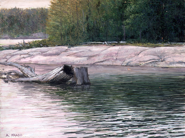
PINK ROCK 20"x16"
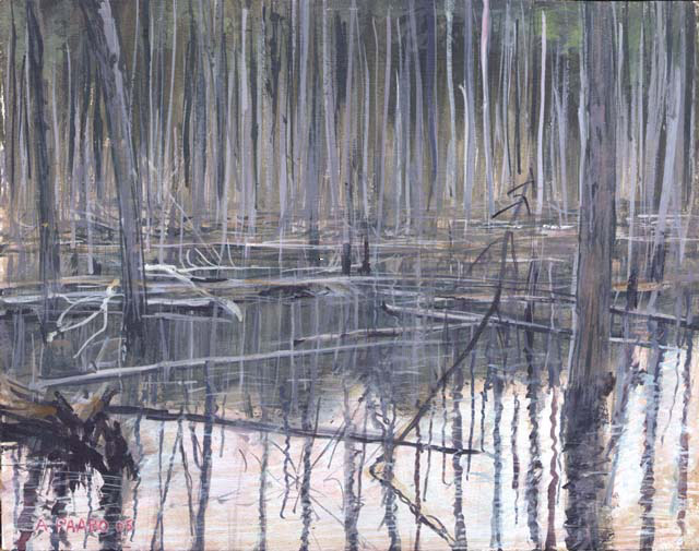
I
was attracted to this scene in a nearby marsh and this tries to capture
the feeling and the abstract design
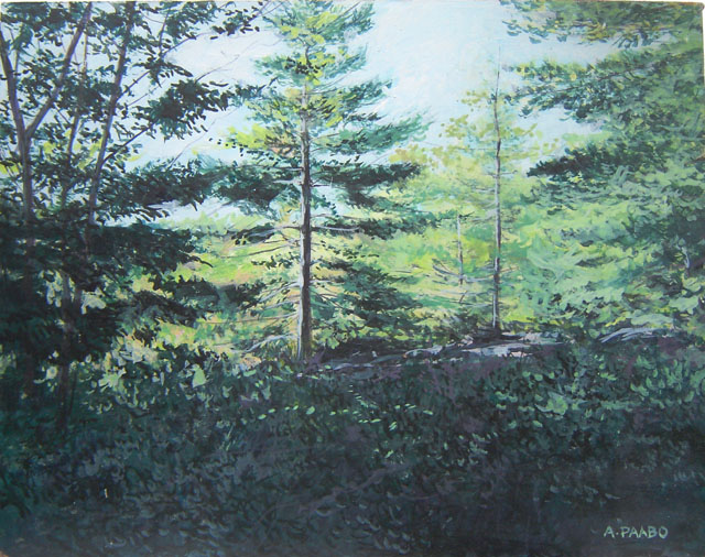
MORNING SUN 16" x 14"
I
encountered this scene one early morning at Bon Echo Provincial Park
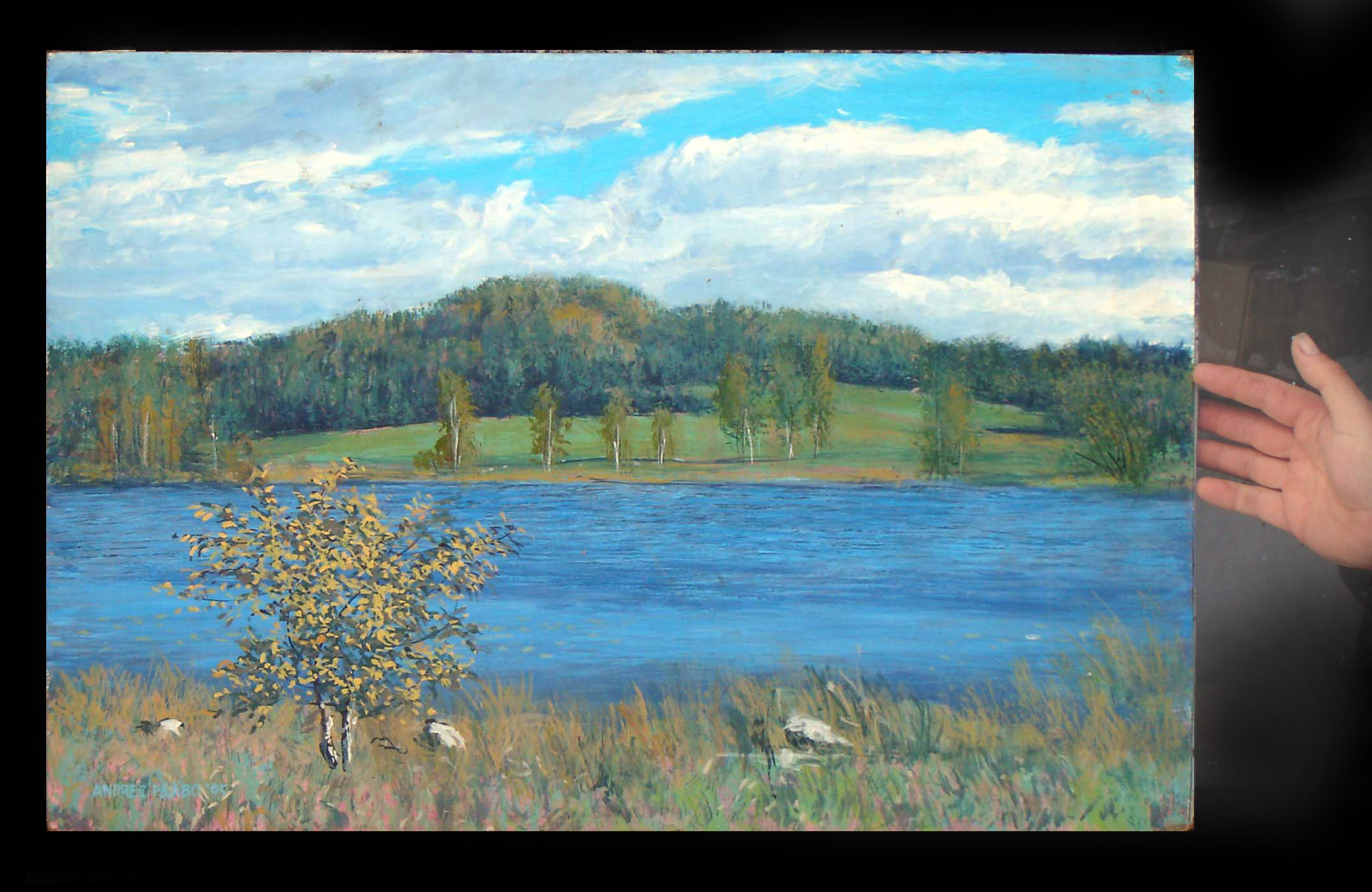
BLUE LAKE
This
is an instance in which I painted with a thick brush on a large panel
in the same way I paint with a small brush on a 10"x8" panel. Since
price is based on time taken, this only enlarges the art, but does not
add to time. But the disadvantage was that most people did not have the
wall space for a large painting, and always chose the smaller version.
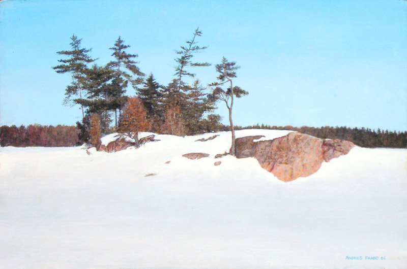
PICNIC ISLAND IN WINTER 30" x 20"
This
island in Eels Lake is very photogenic. Its windswept trees and granite
rocks are very attractive. This became my norm for larger paintings -
to paint with the same detail as my small 8x10's
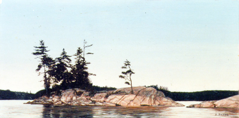
This
shows the same island as above, but in a quiet fall afternoon. (The
water level is lowered in fall, revealing ore of the pink granite rock.)
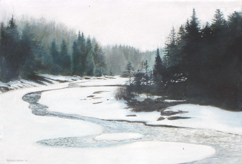
LATE WINTER RIVER 30" x 20"
This
painting was actually based on a scene I saw near Thunder Bay. It's
beauty lies in the way the eye can meander into the distance.
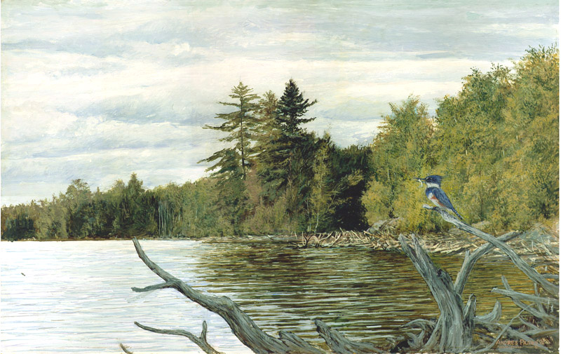
EAST SHORE 30"x20"
I
was attracted to this shore scene not far from where I am located
because of the attractive pines. I added the kingfisher in the
foreground as a surprise element - however it has a significant role in
creating interest in the foreground.
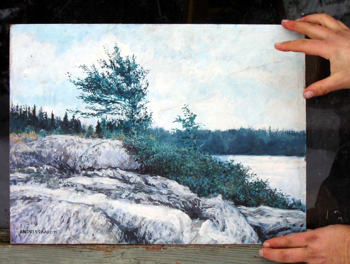
WINDSWEPT CLIFF
I
painted this scene several times, based on a cliff at a nearby lake. It
was an interesting pursuit of textures and shapes. Each time I tried to
improve the design and effect.
LAZY RIVER 24" x 24"
I
painted this on canvas in a traditional 'painterly' style mainly to
remind myself of the traditional technique which I learned as a
teenager.. Although it is quite large, it's price is not high because
it is done in a loose style.
Pink
rocks covered with pines and junipers etc is common across northern
Ontario, In this case I made the distant shore thin, very far, in order
to keep attention on the foreground. As with the above painting, it is
painted large and not in the normal detail level
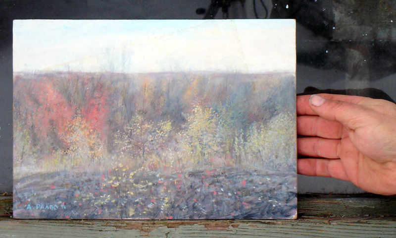
AUTUMN HAZE
This
painting is mostly subtle colours intended to capture the feeling of a
hot fall day - Indian Summer.
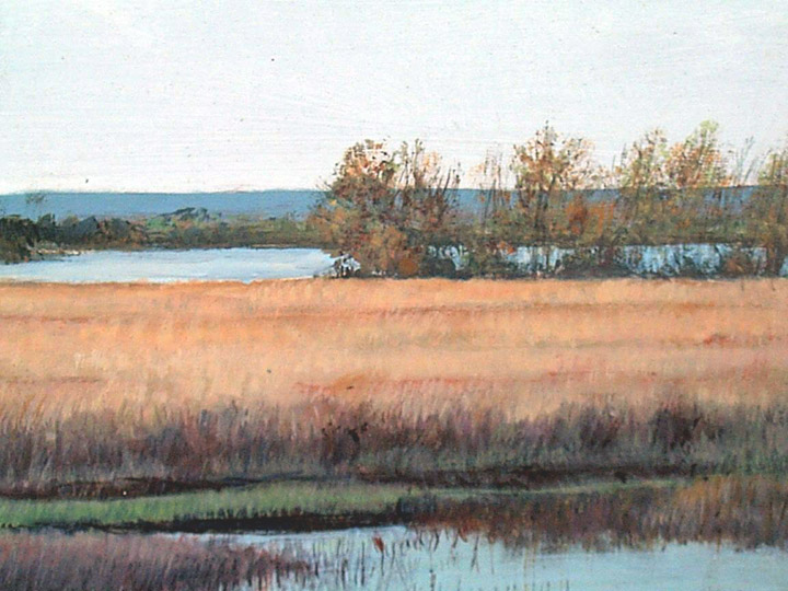
MARSH ALONG LAKE ONTARIO
I
found this scene located along Lake Ontario near Brighton as
having an interesting design of colours
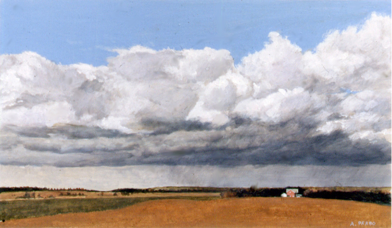
RAIN CLOUDS about 24" x 16"(?)
This
scene scene in southern Ontario farmland, become a narrative painting
by the presence of the farmhouse.
SOME
INSPIRED PAINTING PROJECTS
When more information and detail is introduced into
a painting - also
of larger size - the painting becomes more storytelling, has more
narrative - and that additional content takes the painting to a new
level.
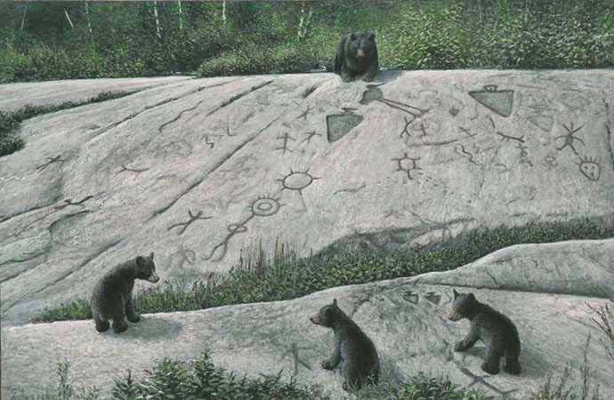 THE TEACHING ROCKS 48" x 32"
 This
painting, more than any other wildlife painting, is also a portrait of
a real place. The rock carvings in the image are accurately positions
and painted. While it portrays a specific place, someone who does not
know that can see it in general terms as 'Native rock carvings'
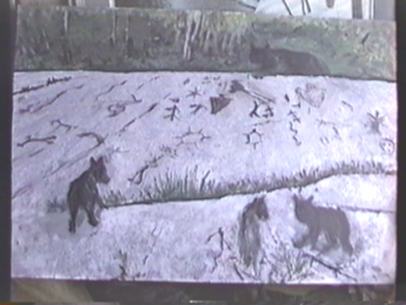
(RIGHT: HOW THE PAINTING LOOKED AT EARLY STAGES
>>>
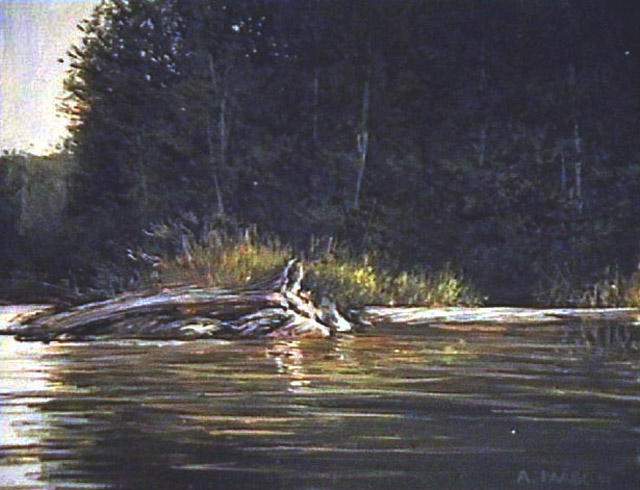
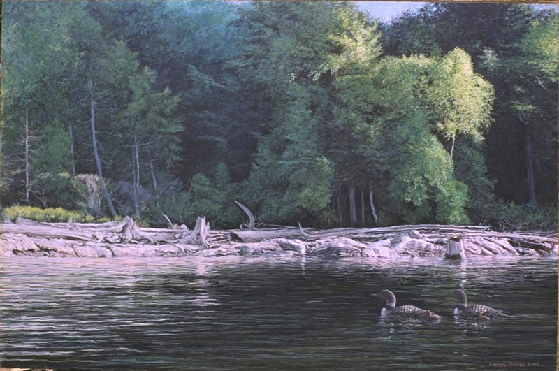 DRIFTWOOD SHORE 48" x 32"
The above painting
is also more a
description of an actual place, but it anyone can relate to it, because
its elements can be found everywhere - sunlight, driftwood,
rocks.
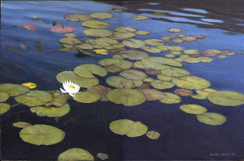 LILYPADS
ABOUT 30" x 20"
I
was fascinated how a lilypads formed an interesting pattern that even
if you do not know what the reality is, produces an interesting
abstract pattern with the white flower as the focal point. And when you
know what is being shown, symbolism and metaphor enters the art.
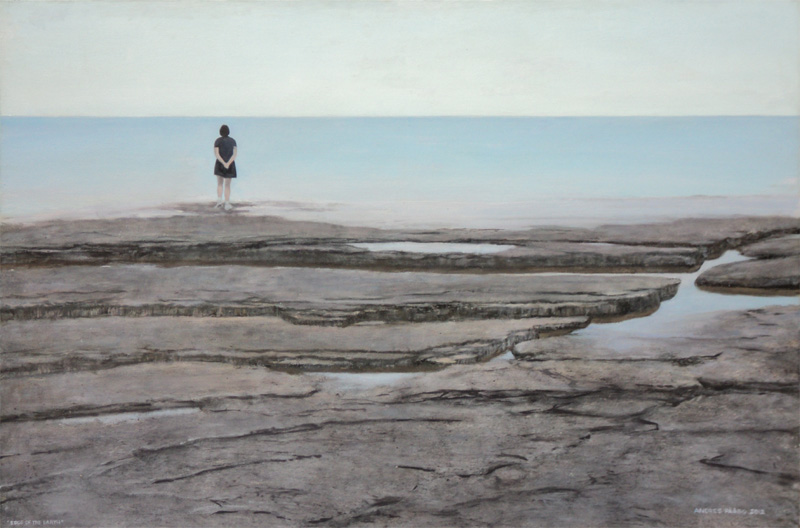
 EDGE OF THE EARTH 48" x 36"
Based on flat rock edge on the east
coast of the Bruce Peninsula facing Lake Huron, I saw the abstract and
symbolic design in in, contrasting rock with water with sky. The figure
at the edge gives a human context to it. It is also part of my
exploration of adding humans, instead of wildlife, into landscapes (see
later for more about my putting humans in landscapes)
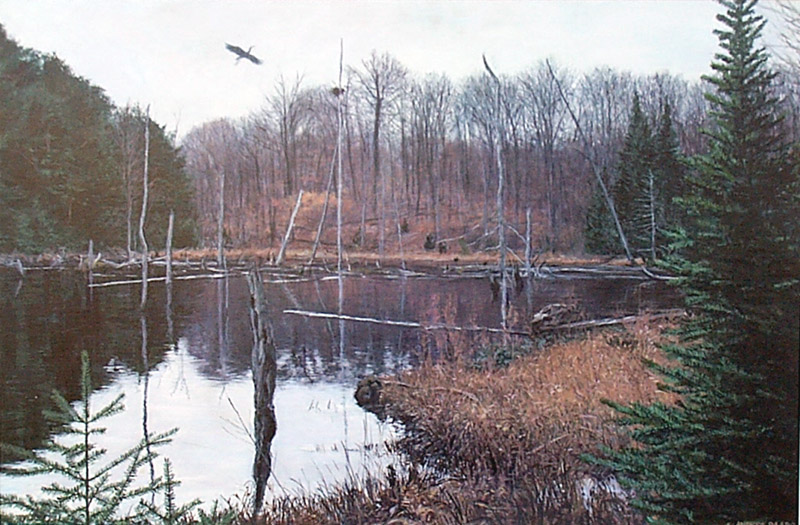
 HERON ROOKERY 30"x20"
This painting originated from a
photograph, but I was already familiar with such scenes. I adjusted the
scene to make it more balanced, and more interesting - the usual
technique.
Many of the paintings shown on these pages
actually portray a real place in the background, and the animal has
been worked into the scene. Thus to one degree or another all
portrayals of nature are portrayals of real things the artist sees.
Nature scenes cease to be portraits, if the artist revises, changes,
modifies the scene which was the original inspiration. Some of my
paintings are like that for the simple reason that nature is not
perfect. If you saw the actual photo of a particular scene in a
painting, you will see that the photo is quite chaotic and unpleasant.
I have redesigned nature to make it more 'perfect'. It would be
analogous to painting a portrait of a person, and making that person
look more beautiful that they really are.
3.4 WILD STILL LIFES AND CLOSUPS
When one thinks of landscape, one things of scenes
receding into the
distance However, just as in the traditional art there are closups of
bowls of fruit or vases of flowers, etc, so too it is possible for a
painting to study an interesting section of nature up close. Here are
some which are clearly that.
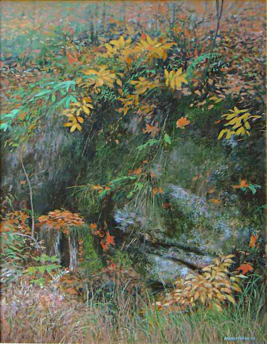
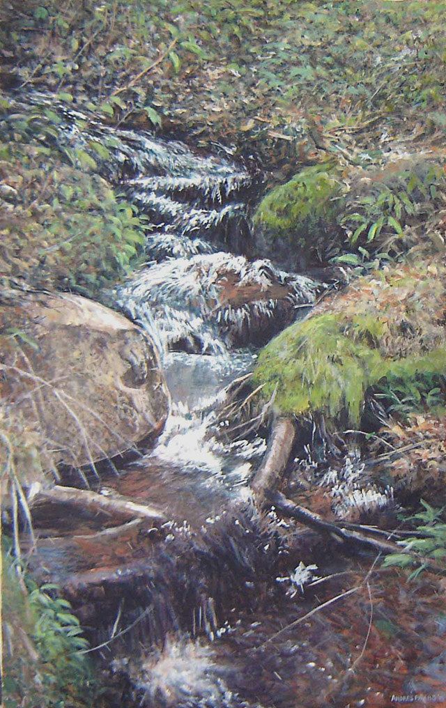
 FALL SPRING 20" x 20"
While I start with a real scene, in
order to create an organized, interesting, system of shapes, textures
and colours, I have to slightly 'redesign' nature to remove the
imbalance, etc. This image could not be achieved with a photograph -
well, maybe if you spent a week and took 1000's of photos you may find
one that is perfect - or the photographer carefully set it up in studio.
 DECORATED ROCK 20" x 28"(?)
I saw these interesting autumn
colours at a rock beside the road, and used it as a jumping off point
for a painting. Note, as always, I basically redesign the actual nature
to make all its elements form into a moving abstract design. As I say
again and again, nature is never perfect. The artist has to rearrange
things, add and subtract, etc. (Or a photographer has to spend a summer
taking thousands of photos to find a perfect design occuring naturally
- all MY photos are imperfect, and my job is to make them perfect.)
 SPRING RUNOFF 24" x 42"
I painted the action in the lower
portion years ago, but I also had photo records of the upper portion.
So I had the idea of creating a long painting showing more of the small
stream . In this case, there is more from my imagination. It is also a
looser painting.
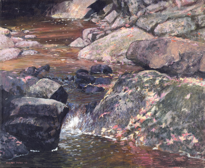
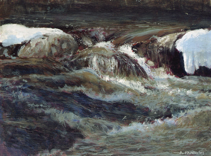
 RAPIDS 20"x12" (?)
This painting was a challenge to
myself to see how real I could make moving water during spring melt,
inspired by the rapids of Clanricarde Creek.
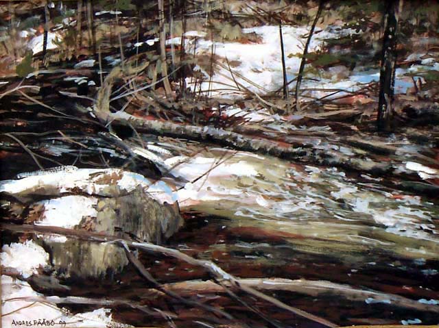
 SPRING RUSH
This scene occurs in early spring
when suddenly the weather is very warm and snow is turning into streams
everywhere, and then in some weeks it is gone. This is a case of me
trying to capture not just the warmth but also the lively action
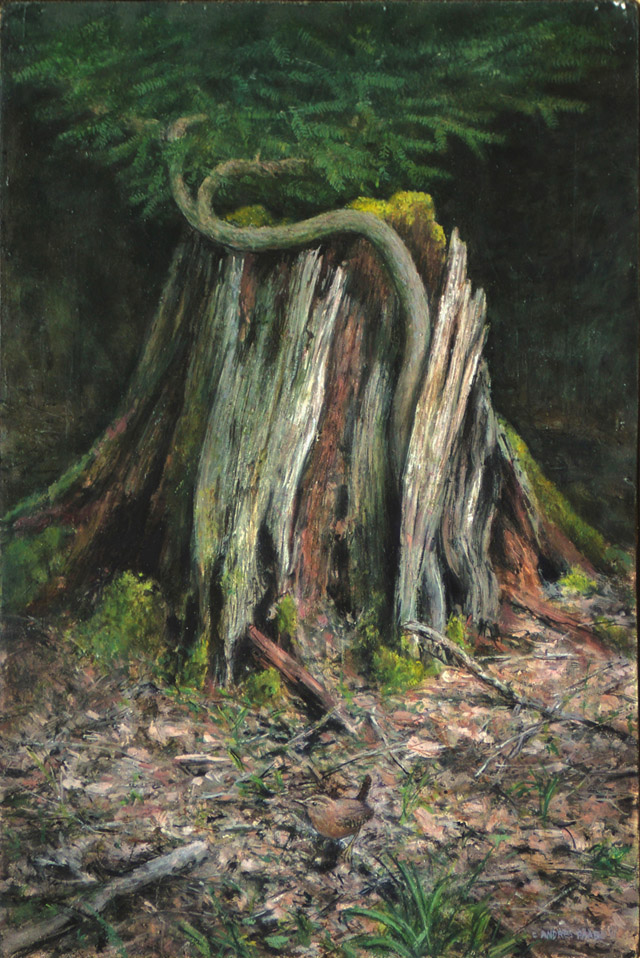
 REBIRTH
This is a painting unlike anything
you have seen before. It shows how a new tree can grow out of a
decaying stump. This gave my a symbolic idea - showing how nature
regenerates itself, recycles itself, whereas pollution does not
recycle. As a final touch, if you view the original, you
will see a wren on the forest floor.
3.5
NATURE AS ABSTRACTS
I have two large 48"x48" paintings which, altough depicting
nature,
highlight the abstract side of the painting. Some people seeing them
for the first time do not realize immediately that it depicts a real
natural scene.
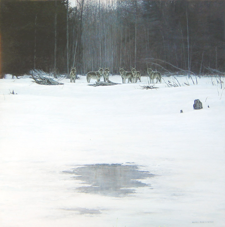
 PATCH OF ICE 48"x48"
I was intrigued by the 'feeling' of
the trees in a bay - subtle greys. To enhance it I imagined a
pack of wolves there. To give a strong sense of the third dimension, I
wanted some detail in the foreground, and decided on showing a region
of the ice that was blown clean of snow by the wind. Overall, you will
note that this is an abstract design as well.

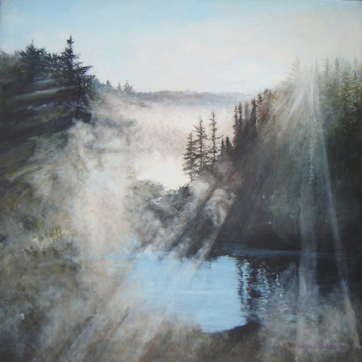
TEMAGAMI SUNRISE 48"x48"
I
saw such a misty scene when I travelled south from Temagami,. Ontario,
at about 6AM. I stopped and took many photos, and those became my
source of inspiration to develop a painting that portrayed a real
event, but also, overall had the same effect as an abstract.
A BASIC TRUTH: ABSTRACT ART IS
UNDERNEATH ALL GOOD ART BUT AVERAGE
PEOPLE NEED REALITY ON
TOP, AND CANNOT UNDERSTAND IF REALITY IS MISSING.
|
This may make you ask the question whether this
validates "abstract art". The answer is that ALL good art has a
good abstract design underneath it. Abstract art is about the
psychology of shapes, colours, lines, textures etc. But this psychology
has developed in humans through a million years of experience in
nature. Thus abstract design is born of our experience in nature, and
so by using natural elements to create good abstract designs that
create particular emotional and intellectual responses, we return to
the very origins of abstract art. All humans will understand abstract
art if it is created from real natural elements, because the realism
puts the viewer into the context. When abstract art is removed from any
reality, then the average person has no way of interpreting it.
Sometimes abstract art attempts to help the viewer by the title - such
as calling alot of vertical black lines as "a forest". Without
the realism on top of abstract art, it is merely a meaningless bunch of
lines, shapes, colours, etc. and no different from what can be produced
by a child or a chimpanzee simply playing around with artist supplies
to achieve "interesting effects". Perhaps there is a place for
"interesting effects" but they should be priced accordingly. When the
Art Establishment is confronted with art produced by apes or
chimpanzees, they say "it is not art because the ape or chimp does not
intentionally design the painting. Instead, the ape or chimpanzee
generates them one after the other and it is the human art dealer who
selects the ones that look interesting." My response is that human
artists do the same!! They generate painting after painting, and then
select the ones that 'work' and hide or paint over the ones they
reject. The only difference is that while the chimpanzee has not
context by which to select the best, the human artist does. But when
either man or ape creates interesting lines, shapes, colours etc, they
are both doing the same thing - achieving results that resonate with
psychology, which originates from evolutionary experience in nature. If
a chimpanzee artist learned what kind of art his human master likes, he
too can select which of his wild explorations to show to his human
master. In my opinion, EVERY painting I create is an abstract. The fact
that I make the abstract coincide with real elements from nature, does
not alter this fact. The only difference is that the human being
can understand it when the abstract has reality on top of it, as it
gives a real world context, while if it doesn't it is just a jumble of
lines, shapes, colours, etc in limbo, without any connection to reality
- except if it is used for giving interesting design to walls,
furniture, carpets, etc.
I selected the two large paintings as the best
examples of simple abstracts, but ALL paintings have abstract designs
underneath them. The trick is to use the abstract design to generate
the psychological responses suitable for the subject matter. (For
example, one would not want to have bright, happy colours if the
painting shows a pack of wolves. ) As you saw in my demonstration
above, all my paintings are abstract paintings within a couple hours.
Developing the painting to put the realism on top, complete with
additional symbolism and narrative, can take another hundred hours.
Thus it is outrageous that art dealers will try to sell abstracts that
take a half day to create for the same price as a realistic painting
that took further weeks.
3.6 MORE IMPRESSIONISTIC TREATMENTS
The truth is that there is a spectrum of techniques
that range from pure non-representational abstract (lots of lines,
shapes, etc) that produce emotional reaction) to suggested reality in
the abstracts (such as an artist creating alot of vertical lines and
calling it a 'forest') to more and more reality, leading to the
impressionistic techniques. When the abstract designs are noticable in
the painting technique, we call the work "painterly". As I have said
elsewhere, traditonal realism strives to make the painting technique
invisible. It is similar to how handwriting is invisible - the reader
seeks what the handwriting says, But if the writer writes with crazy
flair, the handwriting begins to intrude. Note that it is not necessay
to be realistic for the painting technique to be invisible- if the
viewer is familiar with the technique and is looking beyond the
technique in the same way we look past the handwriting to its message.
If the abstract design, thus, is not noticable, and
the purpose of the painting is to offer a visual narrative, then that
form of art will be the other end of the spectrum. But there is always
the abstract design underneath all art, whether or not we notice the
handwriting, or painterliness, or not.
The following are examples in which I leave some
presence of the painting technique, where this helps convey emotion.
(Detail has the problem of making a scene cold and technical, so
sometimes blurring, etc to avoid obsessing on detail is desirable)

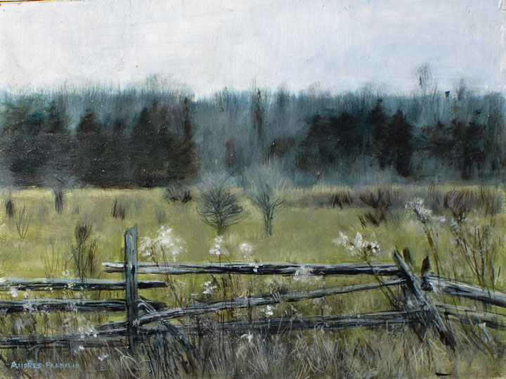
THE FENCE AND FIELD
The
background is blurred and suggested, partly to keep the viewer's
attention on the foreground.

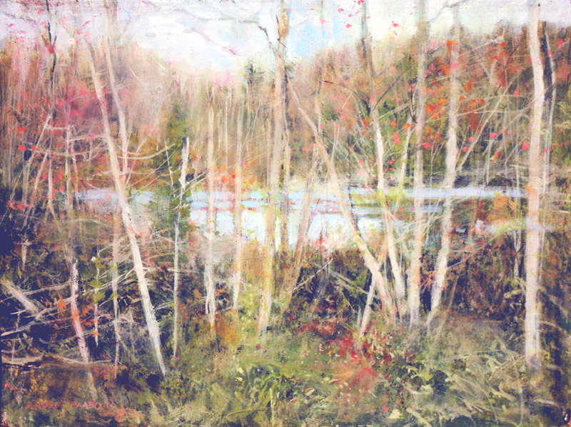
THROUGH THE TREES
This
scene had a great mess of foreground trees, so I decide to blur it and
show it impressionistically so that the foreground would not be made
more important than the pond we are actually looking at

OPPOSITE SHORE
This
is the scene on the opposite shore from me. It is the same location as
the painting of the deer when I was 14 or so

THE POND
All
my paintings start more or less like this, but this is an established
painting style for final works - most commonly used by illustrators.
Usually I consider this stage to be the beginning of a painting I
develop into more detail. However, this one happened to be very lively
and interesting at this stage, and I realized I might leave this
painting as is If I want to paint this scene in more detail I can
start another painting. It is easy to see that it could also be a
detailed scene perhaps containing a heron in the water - or a
moose. An artist has to know where to stop.
The above examples merely show my flair and emotion
in my brush technique found in all my paintings, taken to extreme.
These are only some examples where the technique is especially
noticable.
3.6
PORTRAITS OF NATURE: SMALL LANDSCAPES
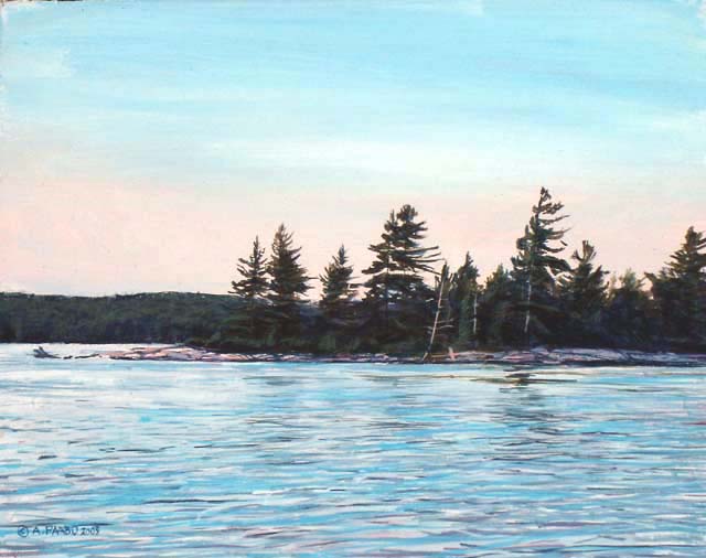
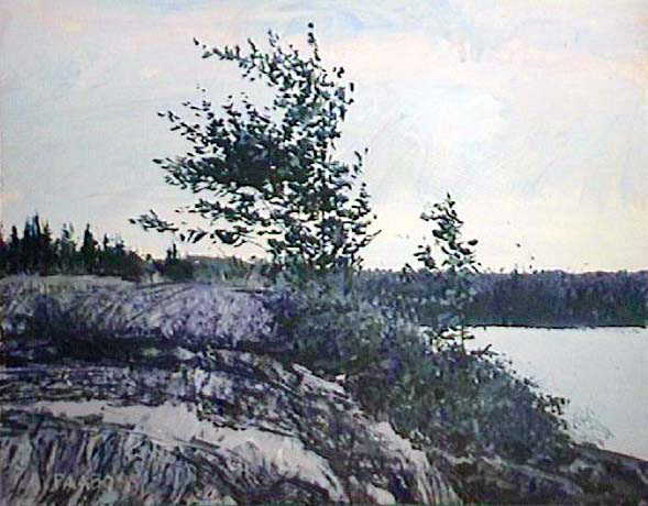
I have already spoken in detail about the small
paintings by which I first capture the images of nature I encounter.
This section will present many of these small paintings. Many were sold
in galleries for prices up to $500 framed. It depends on the success of
the result and the level of detail. When I was a teenager in 1964, I
remember selling a small painting for as little as $95; but if we
investigate inflation since then, that price would be as much as $500
today. As money loses its value, people remember how much things cost
earlier. The pressure was on me to keep selling my small paintings as
if in 1960-70 Canadian money. I had a major row with someone who wanted
to commission a portrait from me, and pay about the same as his
grandfather paid back in 1964 which was I believe $65. That one had two
hour sittings five times, totalling 10 hours, or $6.50 per hour. Even a
teenager cleaning floors in a fast food joint will make twice that
amount. In reality, adding preparations before and after, the proper
amount of time would be more like 15 hours and if I demand a more
reasonable $35 hr, then that gives roughly the $500 that inflation
suggests. So I insisted it had to be $500. Nothing irritates me more
than the lack of respect for original painting and customers trying to
make me accept less than minimum wage for my lifetime of experience and
talent. I got so fed up by the person who wanted a portrait of himself
for the same as his grandfather spent 50 years ago, that I was prepared
to let that commission pass by. It took him a year or so before he
contacted me again. What an insult! I should be making $50 per hour. In
Toronto there is a portrait artist whose head-and-shoulders painting
starts at $1000. That is very reasonable, and only possibly because he
deals directly with the public and does not have a gallery commission
subtracted.
So the following paintings took - all time
considered - about one per day. What is a day of work worth? Minimum
wage is $100/day. To make a living I allowed art dealers to buy small
paintings for that, in effect treating me like a minimum wage earner. I
later raised it to $200, which was better. The dealer puts a frame
around it and sells it for $500-$600. You can see who gets paid and who
gets screwed. If you are interested in art, do not buy from art
dealers, especially since now you can contact the artist directly,
visit them to see the art, and study their art on the internet. It all
goes to show that there are three types of people in the economy -
those who make things, those who buy things, and the middleman or
middlewoman who tries to screw both.
You can see why I hate marketing my art. Let me
create art and recieve buyers directly and then I am happy. We live in
a new world today where this is becoming the case - where the middleman
or middlewoman is increasingly
unnecessary. If a painting on this website has a green border, you can
contact me directly, negotiate, and obtain the painting - especially
now that shipping has become very streamlines and sophisticated with
the development of internet shopping.
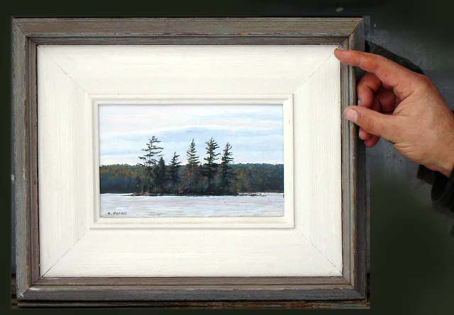
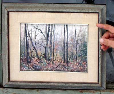
EXAMPLES OF THE
SCALE OF THE SMALL PAINTINGS IN FRAMES


Here
are two small paintings that I framed and put on my wall because of the
success in my technique.


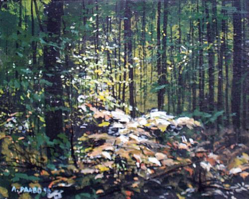
What
you will notice about the following small 8"x10" paintings, is that I
will paint anything that appeals to me. Not everyone cares for
everything I paint, but the constant truth is that if I am personally
excited about the subject then that excitement will enter the painting,
and the viewer will feel it. In addition, I actually enjoy the
experience. Everybody wins.

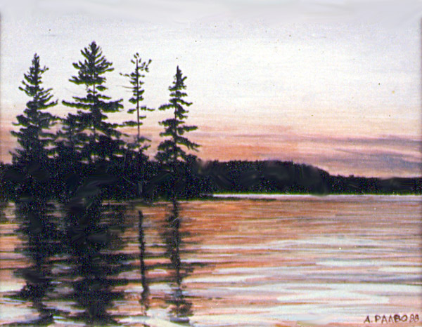


Thus
anything that interests me is valid to paint. It also allows me to get
ideas that will lead to major paintings. It also constantly trains me
to adjust my subject matter to produce strong underlying abstract
designs that make the painting rise above the mundaneness and chaos of
the real wilderness.


The
rule in all art - paint, write, etc what you know - also applies. If
you know subject matter better than the common average person, then you
can show things that the average person does not know. All viewers want
to gain something from a cultural experience. If you merely repeat what
they already know, you are boring.


I
travel through nature and then see
something that strikes me as interesting. I stop and wonder what it is
that is captivating me, and then I can explore making the painting
capture that special thing that captivates me. If successful, I
transfer the special thing to the viewer.


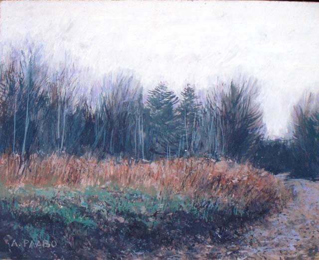
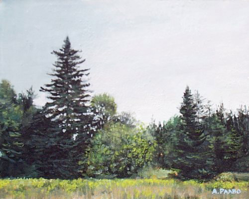
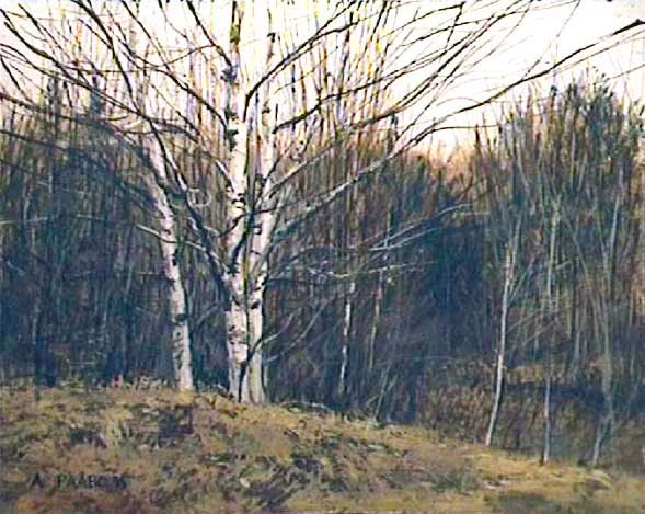
In
some places in my area, the wilderness has grown on the remains of
clearing and farming a century ago. This two paintings are such areas -
where there are grassy clearing or meadows.


What becomes subject matter for my paintings is often totally
unexpected. I simply see something interesting that can be captured in
a painting. Sometimes the attraction is the play of light on water,
sometimes it is the abstract shapes in the remains of a past fire, that
I can arrange into an abstract design.


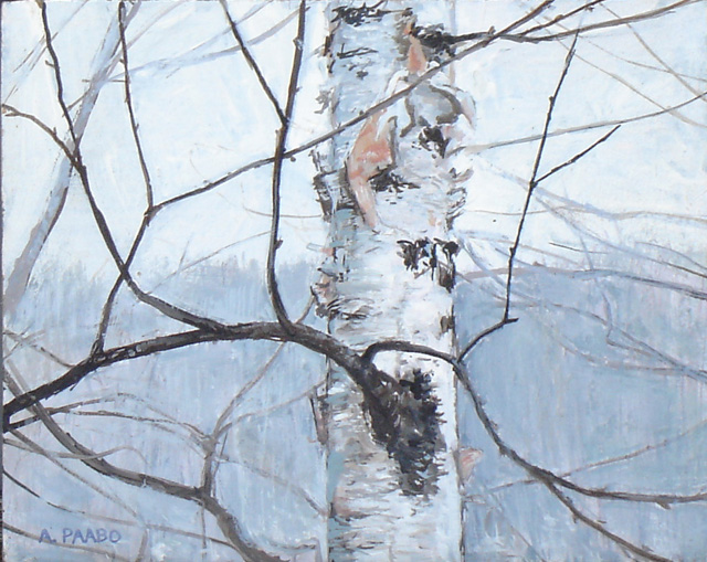
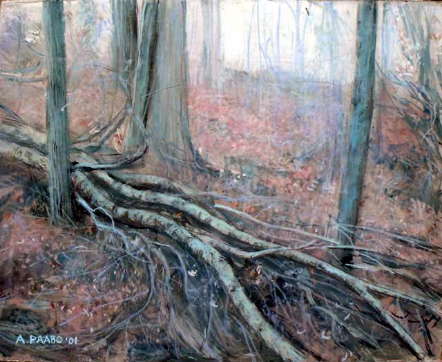
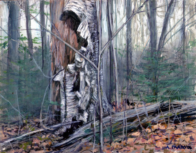
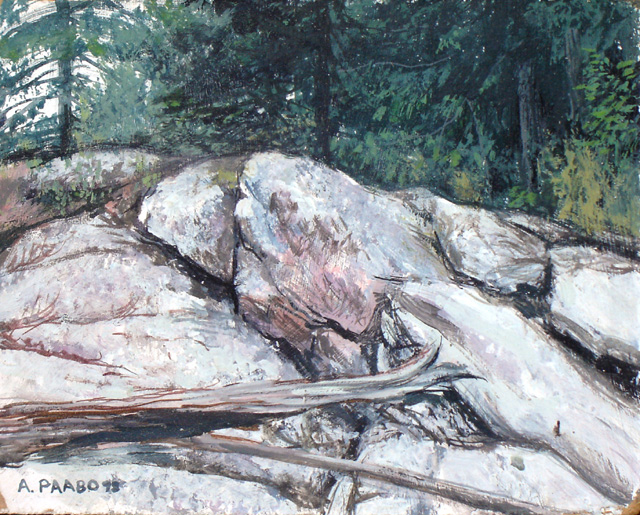
The
above two paintings are of the most unlikely subject matter. They are
studies of things in the forest that we normally would not expect has
any beauty, but I then see the beauty and extract it. In the painting
on the left, I was attracted to the misty feeling of the scene. In the
right, I was fascinated by the interesting textures of the broken
birchbark.


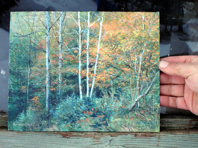
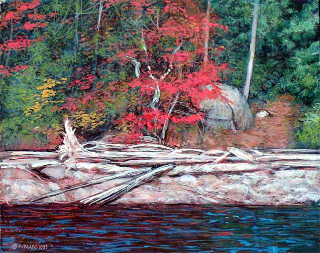
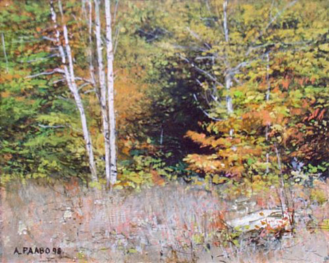
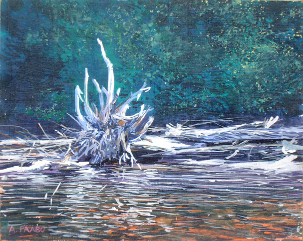
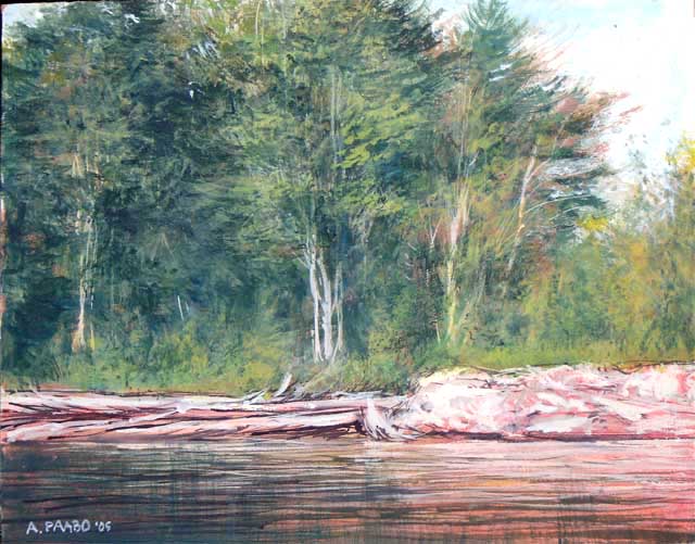
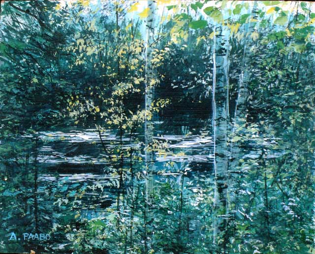
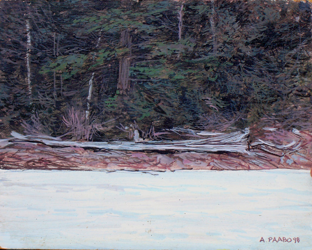
In
these examples, I became fascinated by the character of birch trees in
one and driftwood in the other. What happens is that I in effect give
these object livingness. In a way you could say that in giving life and
importance to things in a landscape, I am expressing the original
animistic view of nature found in all humankind who lived or still live
integrated with nature.


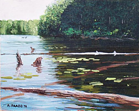
These
two are studies of light and water. Sometimes what I find fascinating
is unique to me. As much as I like the painting on the left, not many
people can see it on their wall.


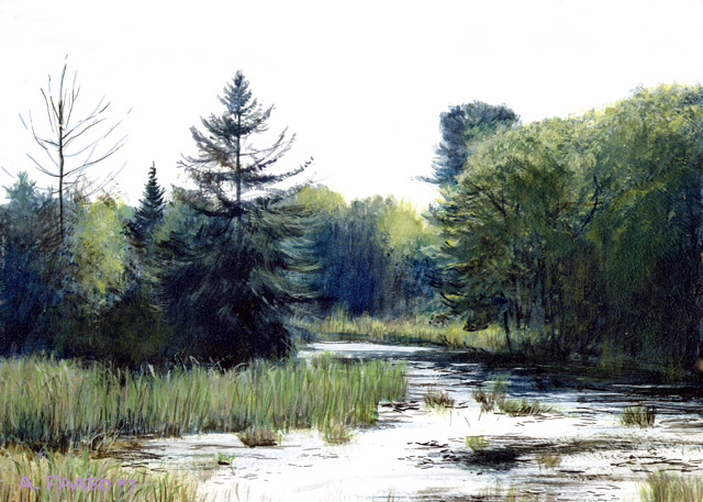
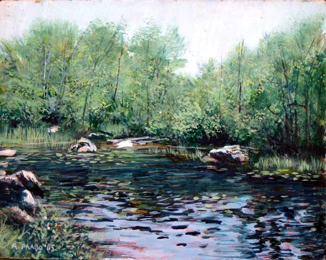
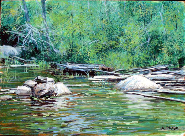
These
two paintings are of the same pond-like area beside the highway near
Buckhorn Ontario. I cannot understand exactly what appealed to
me about it. Perhaps it is the variety of detail, and the strong
colours reflected in the water.


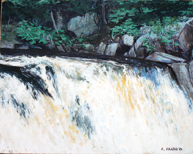
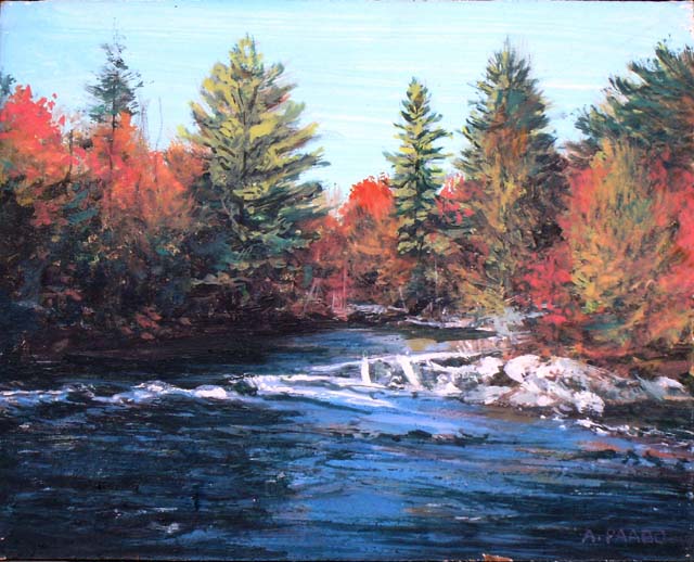
Two
paintings inspired by rapids or falls. In one case I wanted to see if I
could paint the falls in such a lively way that it looks real. (Bad
painting fails to make water feel fluid). The other painting shows
rapidly moving water in advance of rapids and falls, but it is made
more interesting by the variety of elements in it and colours.


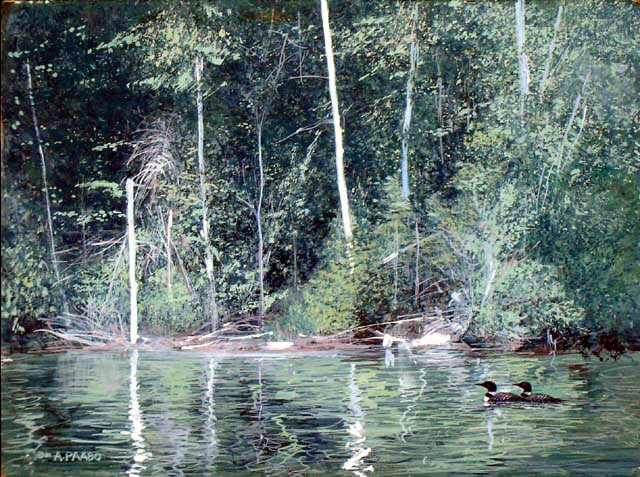
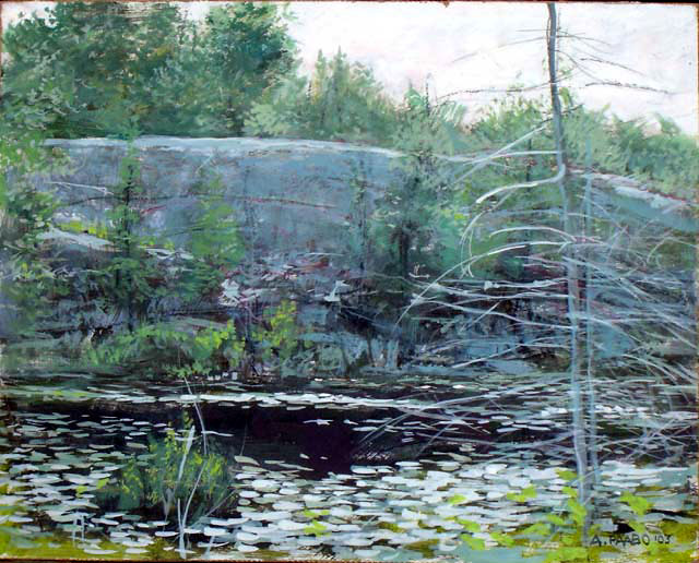
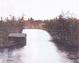
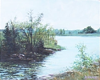
Both
these paintings lacked variety of objects, but in one, I worked at
capturing the character in the trees, and in the other capturing the
liveliness of sunlight making leaves sparkle


90% of my small quick paintings is of
the wilderness in my environment no more than maybe 4 km away.. But now
and then I go to other places, and see something interesting. The
painting on the left is a design I saw at Sandbanks Provincial Park in
the afteroon sun. The painting on the right is of the ridges west of
Burleigh Falls.


But
most paintings are from not far away. One only has to keep one's eyes
and mind open for the ideas to appear unexpectedly. The painting on the
left is in the bay just a km to the south, and the painting on the
right is a rocky cliff I saw from my boat a km or two to the north on
the lake.


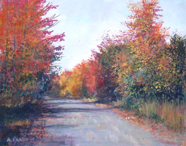
These
two paintings feature roads. The road on the left is Eels Lake Road.
The painting on the right simply shows some trees etc to the left of a
narrow dirt road that used to lead to my property. I think the painting
on the right is a remarkable capturing of the scene


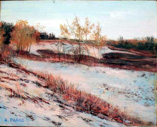
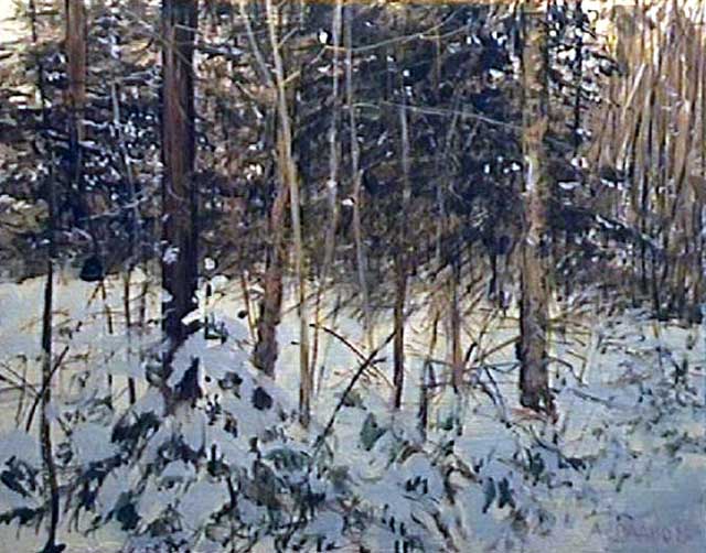
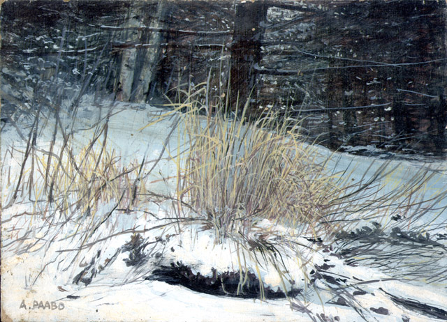
Winter
does not reduce the opportunity for attractive subject matter. The
painting on the left is interesting from its great variety of elements,
including grasses. The painting on the right is a little n the simple
side. I thought that adding an animal, like a wolf or bobcat,
might add more subject matter, but I left it as is.


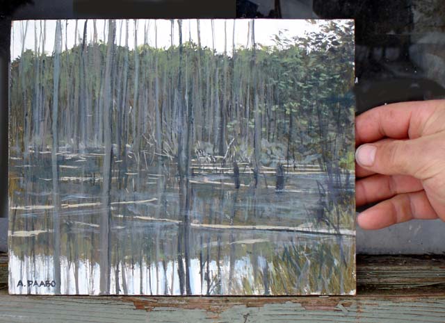
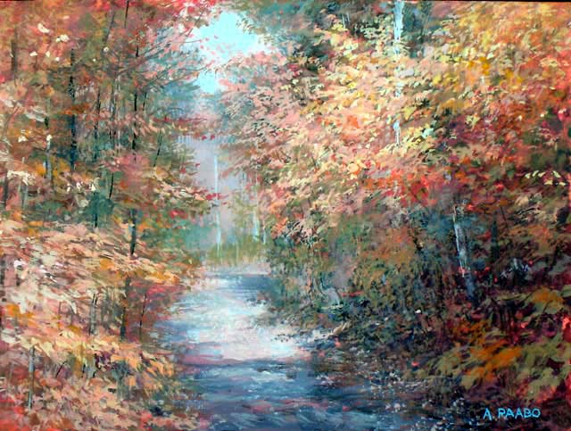
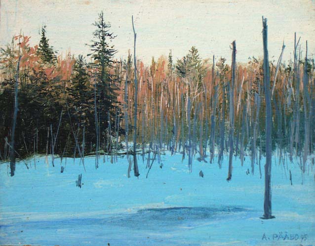
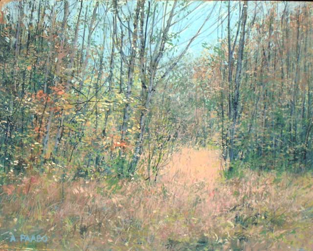
An
interesting scene can appear anywhere. The left scene is late afternoon
at the snowcovered pond made by beavers, and the right scene is the
play of sunlight on leaves and branches at a clearing. Both paintings
use the device of having a way for the eye to recede into the distance.


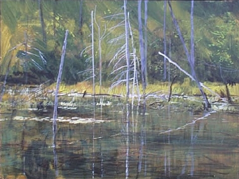
The
scene with sunrays falling on an island is something I saw. I am
inspired to possible develop a large painting with such a sky effect.
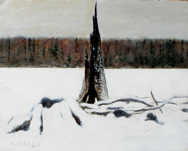
The other painting, the old burnt stumps was a natural subject for
study.


Two
scenes involving water, captured while I was travelling.


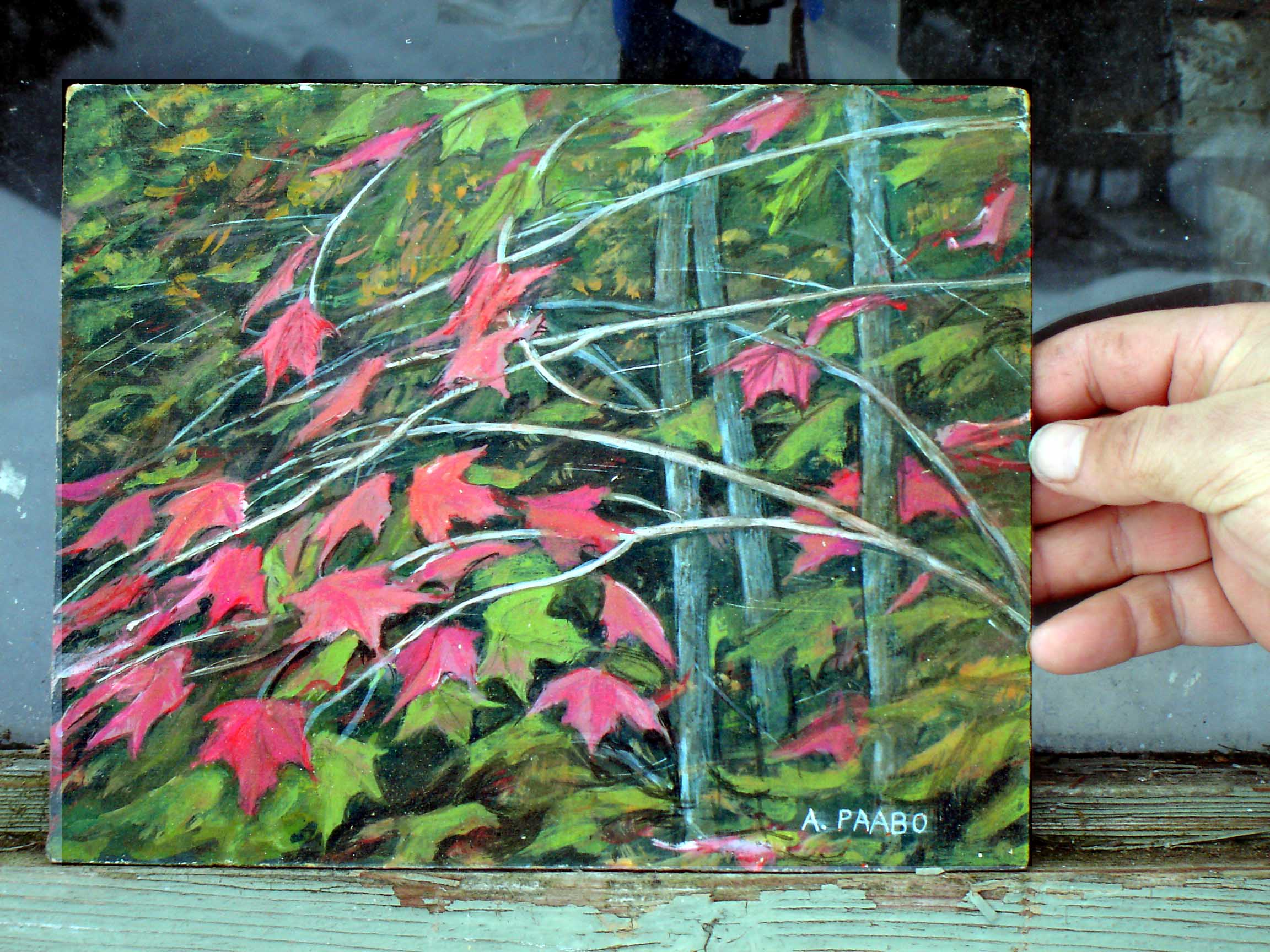
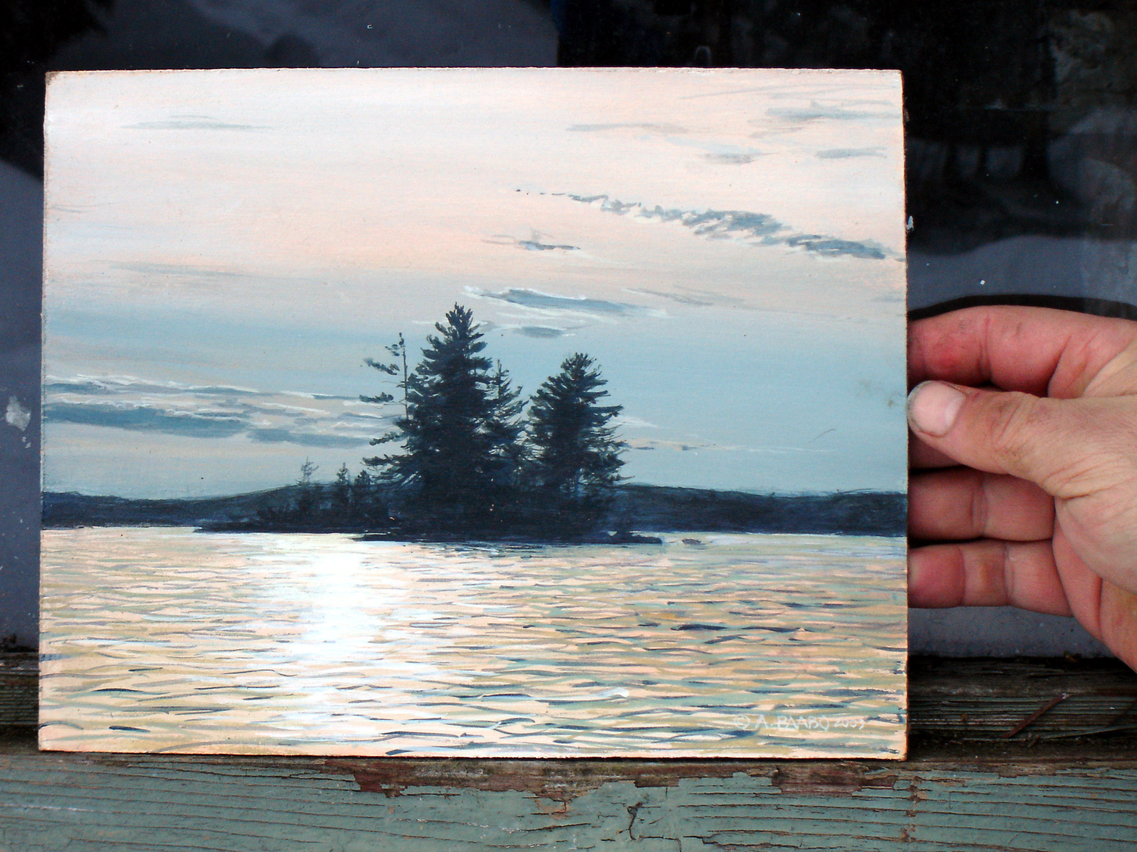
The
paining with the maple leaves is somewhat designed to form an abstract
arrangement. The sunset scene attempts to capture an unusually golden
situation on the water.
AND THERE WERE MANY MORE...
It is clear that painting these small
paintings was
invaluable to me for exercise, for getting ideas for more serious
paintings, and for making a living - since people loved most of them
and because they took less than a day each to paint, they were
affordable. There was a time between 1995 and 2005 when I had
maybe as many as a hundred of them that I took around to galleries. It
was exhausting, and I needed to take breaks, and work on more serious
paintings too - such as those shown ealier on this page.
written
April 2016
by the artist
contact: A.Paabo, Box 478,
Apsley, Ont., Canada
2016 (c) A. P��bo.




 This
painting, more than any other wildlife painting, is also a portrait of
a real place. The rock carvings in the image are accurately positions
and painted. While it portrays a specific place, someone who does not
know that can see it in general terms as 'Native rock carvings'
 LILYPADS
ABOUT 30" x 20"
I
was fascinated how a lilypads formed an interesting pattern that even
if you do not know what the reality is, produces an interesting
abstract pattern with the white flower as the focal point. And when you
know what is being shown, symbolism and metaphor enters the art.