< < <
During the period before 1985 I was testing the
waters to see if I
could make a living full time with the new popular willdlife art and
prints - seeing that I already had an entire early history of painting
nature and animals from age ten to my early 20's (see the last
section). I viewed it as a continuation of my entire youth and teenage
years pursuing nature and animal art - not to mention portraiture which
was good training for portraying animals. But I was no sure about being
able to do it fulltime. I could continue in the profession of planner I
had become established in, and pursue it on the side. Or I could pursue
it full time, putting all my attention into it. Circumstances of my
having already developed a studio situation at the cottage which I now
owned, as well as being unemployed due to the recession of the early
1980's helped me decide to take the plunge and try to at least survive
for a while in a new exciting development in wildlife art and limited
edition prints. So afer several years of getting my
wildlife art into Toronto galleries in the early 1980's (see last
section) thus proving the art could sell, I
decided it was impractical to keep my Toronto apartment when I was
almost always at my cottage, I gave up my Toronto apartment and by
summer 1985 I decided I would make the cottage near the wilderness my
only home, and would for the first time attempt to live there through
the winter. The initial struggles to adapt to the new circumstances is
another story, but eventually I was able to place myself into the many
art festivals that were cropping up, the most significant being the
Buckhorn Wildlife Art Festival. While I also tried to consign art to
the several Toronto galleries (Lowrie, Eaton's College St, BJ Thomas...
those that accepted wildlife art), eventually I realized to make a
living I had to pursue every option, and especially get some limited
edition prints made so that I could sell them to the great number of
framing shops that liked them because they promoted framing. This
section is all about the ten years from 1985-1995 during which I
pursued wildlife art and limited edition prints, taking advantage of
the great popularity of it during this time. But it was not to endure
for a simple reason - once the public had large limited edition
environmental illustrative art covering their walls, they no longer had
any room. By the early 1990's potential customers were saying 'I love
that but all my walls are full'. Thereafter, it was difficult to sell
the limited edition prints. Other factors contributed to the decline
too, such as the development of "giclee" reproductions. i discovered
that this new directon in art, based on creating masterpieces and
paying for it through reproductions at affordable prices was a
revolutionary development thanks to modern technology, and like all
past technological innovations that were applied to art, I was keen to
get involved The folllowing describes my journey between 1985-1995
GREEN
BORDER AROUND IMAGE MEANS THE
ORIGINAL OF THE PAINTING
IS STILL AVAILABLE.
A WHITE
BORDER
MEANS SOME LIMITED EDITION PRINTS OF
THE IMAGE ARE AVAILABLE TO PURCHASE.
2.1. INTO THE NEW WORLD OF WILDLIFE ART AND L.E. PRINTS
Wildlife Art For a Wildlife Art Market
My purpose
when I finally committed myself to
pursuing this new world of wildlife art published in limited edition
prints was obvious - to create the highly illustrative painings of
animals in their environment in a naturalistic way, and then publish
the best and most popular images as limited edition litho prints. The
scheme, which others pursued too, was simple. You spend weeks and weeks
painting the very detailed impressive illustrative painting, and then
pay for the time through selling the prints. The original that took
weeks to paint would cost the public who could afford it thousands of
dollars, but a print faithfully reproducing the image could be had for
less than a tenth the price. This was a scheme very different from
traditional art, where the artist generated paintings that were
affordable and could be sold in their original form. While some art
establishment snobs may sneer and scowl at this practice of selling
limited edition prints as art, the reality is that in the original
scheme of things, few artists could afford to spend very much time on a
painting since the more time was spent the more expensive and
unaffordable the painting became. In the history of art, the
masterpieces developed only because the artists had very wealthy
patrons who could commission such works.
GREEN BORDER INDICATES THE
ORIGINAL IS
AVAILABLE FOR PURCHASE
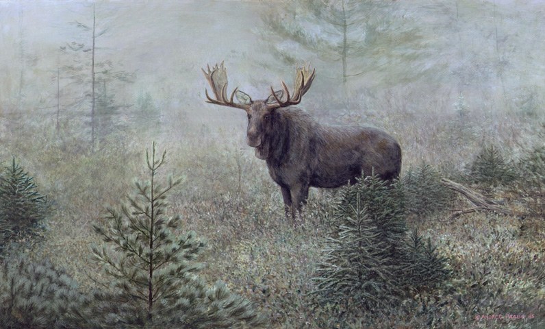
MISTY
MARSH MOOSE 42" X 24" ARTIST HAS KEPT ORIGINAL,
BUT IT IS AVAILABLE ($3700)
 This
was my first major project after
I committed myself to being a widlife artist fulltime for a living. I
recall how I painted it in fall-winter of 1985 and then attempted to
use a router to make a frame for it from 2by4's This was one that
I
wanted to reproduce in print form and add it to my collection of
limited edition prints. However, the moose is not a widely appealing
subject, and I held back on making a limited edition from it. I have
kept the original. The original is available for several thousand, or a
print can be made individually to order for a fraction of the original
by the new inkjet process called 'giclee' Call 705-656-9487 if you have
questions about this one.
So there was a new approach that actually permitted,
for the first time, artists spending weeks even months creating
masterpieces, without being constrained since they understand that they
will pay for their time and effort from the sales of the prints.
The prints then became advertisements for the originals, and the
wealthy collectors could inquire whether the originals were available
for purchase. It was a very good scheme that resulted in a great deal
of labour-intensive, high quality, art that in earlier times would not
have been possible. Although the prints were not originals, since the
paintings were mostly about illustrating the wilderness rather than
capturing impressions of it, the painting technique was not necessary:
all that was necessary was that the print accurately reproduced the
image that had been created. It did not matter that it was not the
original.
WHITE BORDER ON AN IMAGE
SIGNIFIES
SOME LE PRINTS ARE AVAIILABLE
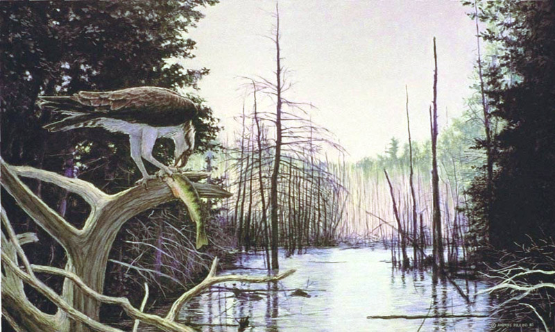 BALANCE OF NATURE 42"
x 22" 1983 WAS REPRODUCED AS L.E. PRINT (SOME
AVAILABLE)
I
painted this already some years
earlier when I was still pursuing art part time. I originally had no
plans of making a print of it, but in case I did, I had a large size
photographic positive made of it of the kind used in reproduction. But
finally, I believe in 1988, I managed to find enough money (around
$4000 at the time) to achieve a high quality limited edition print. I
did not push marketing this one initially because it is not the most
popular subjet matter, and I was disappointed when the limited edition
market became saturated and the demand for limited editions in general
declined. Since I stopped pouring money into promotion and marketing
and sold prints casually alongside originals the distribution of it
reduced to a trickle and as a result I still have many of these
available for purchase. If this image intrigues you, let me know
705-656-9387.
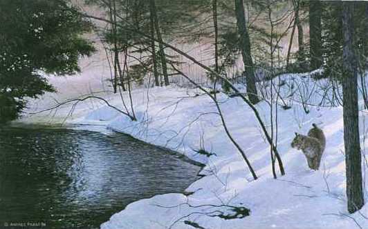
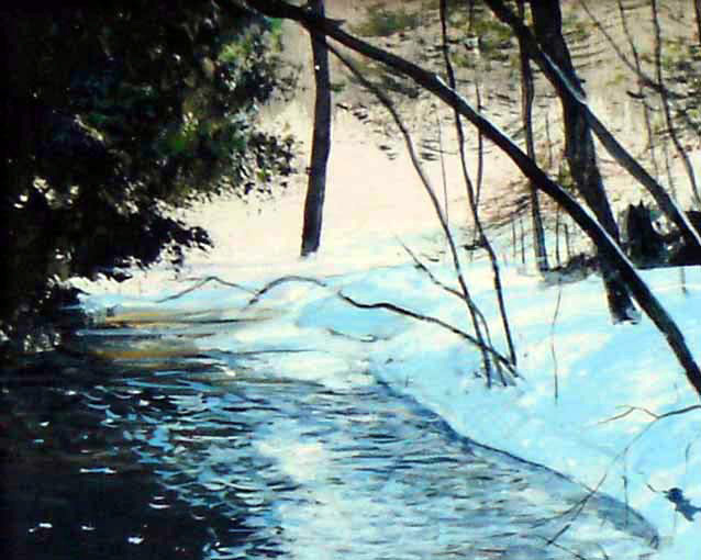 ICE
FREE WATERS- BOBCAT 30" x 20"
ALSO REPRODUCED AS LIMITED
EDITION OF 500 S/N (A FEW AVAILABLE)
I painted this before I committed
myself to wildlife art, intended for publishing as a limited edition.
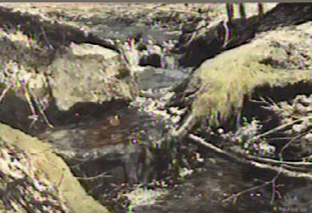
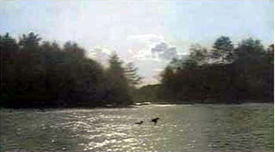
The idea began with a small 8x10 painting shown to the right, that
captured a scene of Clanricarde Creek from the bridge crossing it on
Eels Lake Road.
(RIGHT: SMALL PAINTING THAT INSPIRED THE SERIOUS PAINTING)
MAKING THE PRINT: The cost of printing an image of this side was
well over $5000, and I
could not afford it; however a graphic arts firm in Toronto to which a
neighbour belonged, proposed to the company that they have it printed,
and take half of the prints to give as Christmas gifts to their
clients. Thus I recieved 250 copies to sell. It helped me get started
with limited edition, because I had only been able to publish, from my
own resources, a small print called 'Summer Symphony' . Two
subsequent prints were split in this way ('WIld Shore Loons' and
"Autumn Cascade"), before I was able to manage the printing entirely on
my own
 SUMMER SYMPHONY
This was my first print. I was able
to get it printed at my own expense. It was a limited edition of 680
signed and numbered and I still have a small number left owing to
ceasing to formally market it by the end of the 1990's
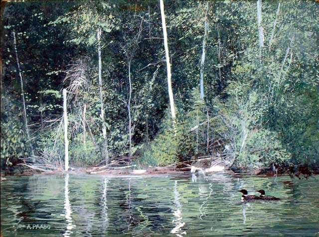
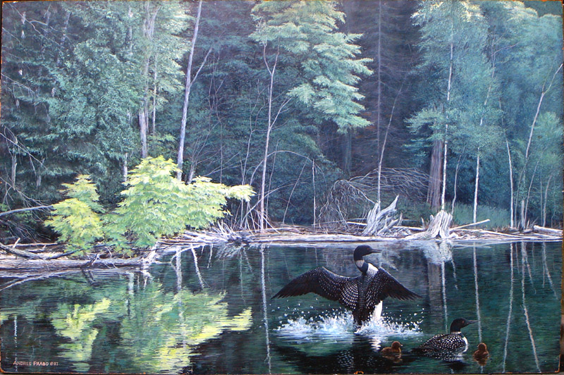 WILD
SHORE LOONS 42"x28" ALSO REPRODUCED AS LIMITED
EDITION o 32" x 21"
After I had my
first limited editions, I was very inspired, and tackled this
masterpiece image based on my experiences deep in Alder Bay, including
seeing loons and young. The original sold for
$6000, prints for $150. The purchaser of the original traded it back to
me for the same size Autumn
Cascade original; hence I have the original, and plan to include it in
a future one-man show.
I thought, and still do, that our ability to
reproduced art images in offset lithography, and now the inkjet method,
has freed art from its traditional constraints. Masterpiece images can
now be owned by anyone, while in earlier times the masterpieces could
only be achieve by the wealthy nobility and the Church. In fact,
this ability to reproduce illustrative images inspired entreprendeurs
to delve into masterpieces of the past, and one can see in print and
framing stores in shopping malls today, many reproductions of very
famous historic pieces, from Da Vinci's Mona Lisa to the romantic
images created by Britain's Waterhouse in the last century. This has a
downside though - the public can affordably fill up their walls very
quickly. It is a market that gets quickly saturated, but is slow to
renew whereas our culture of pop music, movies, television, keeps
renewing itself: the public follows the trends and purchases what is
new.
WHITE BORDER ON AN IMAGE SIGNIFIES SOME LE PRINTS ARE
AVAIILABLE
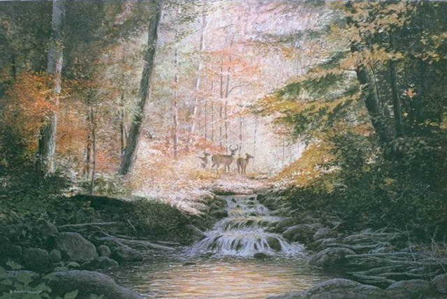
AUTUMN CACADE 42"x28" 1986 ALSO REPRODUCED
AS LIMITED
EDITION o 32" x 21"
This
painting was my attempt to repeat
the success of Wild Shore Loons, this time depicting an autumn scene. I
experiences a similar scene below Clanricade Creek, but I reversed the
direction of the creek so as to have the water tumbling towards me, and
added the buck and two does in the sun in the background. This image
was very successful as a limited edition too. It is an ideal print for
placing in a living room done in warm colours, over the chesterfield.
In any event, this was the world I entered and I set
out to paint images that I thought would be very popular, and to get
them made into limited edition prints. Since offset printing large
images is very expensive, it meant I needed to raise several thousand
dollars, or find a patron to help finance it. Most artists sought out
an art publisher who had entered this arena, and who took the image and
simply payed the artist a small royalty per sale. I did not seek out a
publisher because I was fascinated with the entire process. I wanted to
learn how to get an image printed, and then how to market the prints
and myself. Indeed many publishers wanted to publish me, but I turned
them down. My life was not about making money, it was about being
creative and creativity did not end with the painting itself. If my
life had been about making money, making a living, having a famiy, etc,
I could have stayed in advertisting back in 1970, or stayed in
planning-engineering in 1980. In both cases I would have made a much
higher income, but I would not have been happy.
Thus, I became a regular exhibitor at the Buckhorn
Wildlfie Art Festival and other similar art festivals, where I could
sell my prints, as well as possibly make a sale of a major original
painting. The rest of the year I would be contacting galleries
and frame shops that handled limited edition prints, and inquiring if
they would like to put in an order. I would then package the prints and
ship them out via the local post office. Ironically, though, I
continued to be successful selling my traditional landscapes, and the
selling of limited edition prints was not as profitable as it may seem,
owing to the high cost of marketing, shipping, etc. It became clear to
me that there was a universal constant interest in my small paintings.
Since I liked painting them, my art continued on that path and later -
when the limited edition market became saturated - it became more
important than the limited edition prints. Soon the effort needed to
market limited edition prints was counterproductive, and I put my
attention back to tradional art. In doing so I essentially returned to
my roots. It was exactly what I was painting and selling out of the
marina in the early 1960's. The small landscapes somehow appeal to
human nature and never lose their value.
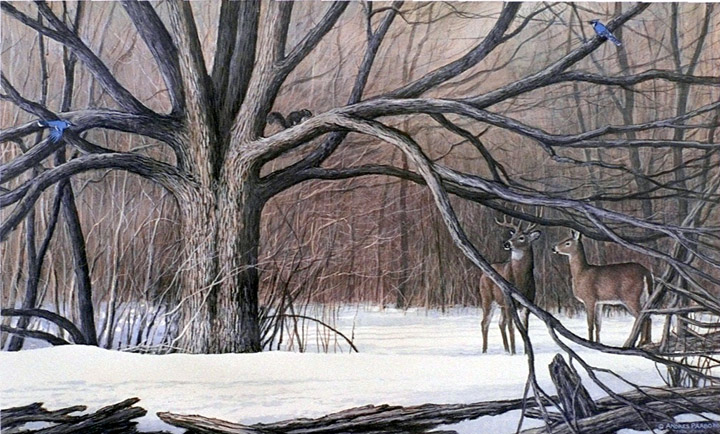
TREE OF LIFE - ORIGINAL 42" x 24" REPRODUCED AS A LIMITED
EDITION OF 30" x 18" (SOME AVAILABLE)
 This
painting was inspired by a cluster of maples that had grown together
into one tree. I of course simplified and designed the branches. In and
around the branches I added some winder animals - the bluejay, the
squirrel, and the deer. The tree is a symbol of how trees embrace and
shelter animals in its midst. The print has been a favourite one for
women.
Under Northern Skies -
Wolves A Major Project
By the early 1990's I was inspired to outdo myself
with the greatest masterpiece I could create. I wanted to create a
large 72" x 48" painting that developed from the painting of wolves
crossing a winter lake I originally concieved of in 1986. I intended
this painting to be reproduced as the third of a series that reflected
a season - the first was summer represented in Wild Shore Loons, the
second was fall represented in Autumn Cascade. This one would represent
winter.
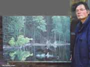
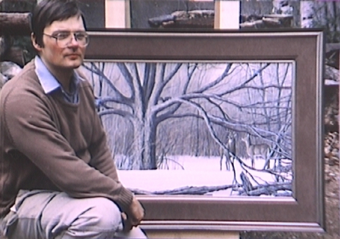
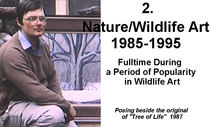
I spent a couple months painting it. The following image shows me in
front of it.
This
photo was taken around about 1995. This was my most ambitious and
largest project. However, it is too large for most interiors, and
really needs a nice large lobby area. I still have it because I have no
talent in hustling and selling. If you have an ideal location for it -
price reduction if it is in a public area where it can be viewed by a
large audience - please let me know.
When it was done, I planned to entirely produce the
print myself. Instead of handing it over to a printing company to do
everything from printing films to final delivery, I planned to get the
photography done by a photographer specializing in photographing art
then get the printng films done by a firm that handled that work, and
then I would deal with the printing firm, giving them the finished
films or plates, selecting the paper, and approving the results coming
off the press. However what happened was that the salesperson of the
printing firm, manipulated the situation so that in effect my attempt
to be involved at each step, and get a better price was upset. I
believe that I was charged by the printing company the same as if I had
never approached the firm who made the films. I was billed by the
printing company I think as if they had handled the entire project as
before. And then I got on top of it a bill for $2000 from the company
that made the films. The final total from both firms, including taxes,
was $10,000. The company that made the films behaved properly, and it
would have gone well if I had not told the printing company what I was
doing before I had the films, and then I could have negotiated a price
with the printing firm that subtracted the films cost. So the printing
company, probably the manipulations of the salesperson, who was the
liason between the industry and customer, in order to maximize his
income, since he was being paid a percentage. I could have pursued the
injustice I saw, but I was by then completely bewildered by the
experience, which included the salesperson botching up the initial run
by ordering poor quality paper. All in all, I spent perhaps as much as
$3000 more than I had to, because, based on previous work, this print
could have been made for $7000 not $10,000. My lesson was that if I
wish to do everything myself, I have to either keep all steps fully
separate or spell it out in the contract.
But of course, you the reader of this, don't care.
Despite my getting screwed in the process, I DID finally get what I
wanted. The final print looks 100% exactly like the original, and is
the highest quality print I have achieved in the traditional offset
lithography fashions. I show the painting image below. Note that I
still have the original, and am looking for a final home for it. It is
too big for a normal home, and I continue to consider various public
lobby areas where such a large painting would fit in well. If you have
suggestions, please contact me. I am not a hustler, and am not actively
pursuing it myself.
WHITE BORDER HERE, MEANS SOME LE PRINTS ARE STILL AVAILABLE.
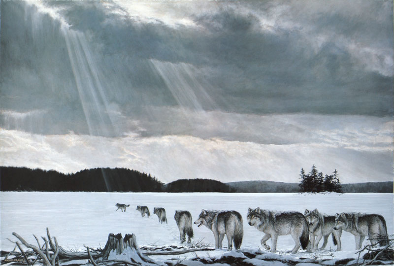
UNDER NORTHERN SKIES ORIGINAL 72"x48" LIMITED EDITION PRINTS WERE
33"x22" (SOME AVAILABLE)
A Major
GIclee Print:
My Next Major Challenge
My printing of Under Northern Skies was probably the
most ambitious printing anyone has undertaken using the traditional
offset lithography approach. When I was doing so, I was becoming aware
of a new process that used the new inkjet approach that was developing
in conjunction with computer technology. At that time we saw the first
of Epson inkjet printers for home computers. Its resolution was not
great, and it was difficult to control. But in the meantime the
printing industry was looking into this technology for the purpose of
proofing printing films. Traditionally proofing was achieved using
photographic paper. When the inkjet technology had mastered outputting
proofs of images destined for the printing press, photographers
observed that these high quality proofing inkjet printers could be used
to output individual prints. The proofs put on good paper could be the
final product. In this way photographs could be output onto any kind of
paper, instead of by photographic methods onto photographic paper.
Artist saw this as a way to reproduce art onto even
rough watercolour paper, creating reproductions that rivalled the
originals. The companies that were creating these printers for the
printing industry found that more and more artists and photographers
were interested, and they began to develop versions for photographers
and artists. Other companies entered the field. Epson, who was
originally making inkjet printers for common consumer use, for
outputting photos from their computers, began to develop larger, more
refined versions, so that today Epson has numerous versions of inkjet
printers designed especially for the professional photographer or
artist.
When this approach was taken for producing art
reproductions, the art printing industry called it 'giclee' after the
French word for applying paint via spraying. The fancy name separated
this method from the everyday inkjet printing. In fact glicee printing
is a very high quality of inkjet printing using inks that do not fade,
and able to cover very large sheets of paper in high resolution.
So in the mid 1990's I looked into creating my next
major print in this fashion. Since I only needed to print two or three
at a time, I was spared the need to fork out $10,000 for a large stack
of prints needing marketing and distribution. One or two at a time, as
needed avoided all the risks. The cost per print was several times
higher than the mass produced press print, but that higher cost was
offset by removing the traditional danger of ending up with a pile of
prints that did not sell.
The giclee print certainly changed the nature of the
art printing game. I watched how many artists tried to transition from
the traditional mass produced print to the individually produced giclee
print. The practice was to declare a limited edition of a fraction of
the traditional quantity (if originally there was 500 prints in the
edition, there was now 250 giclee prints even if there had only been a
dozen printed so far. In other words traditionally all the prints had
to be printed upfront since the traditional press reduced cost by
printing more at a time. But now an artist could simply declare he or
she would only print, say 100, 200, or some other small number, and
priint only as many as was required right now. The limit was simply a
declaration that the printing would stop at that number.
The giclee print helped to unravel that original
scheme of limited edition prints made by offset lithography on high
speed presses. It is still used however if art publishers want to print
several thousand. Printing several thousand on a giclee printer would
take years since each print will take several minutes to be output. I
think the way things are now is wisest - since giclee printing is
naturally slow and limited, it is perfect for art, which should not
exist in enormous quantities. I always found it strange to stop a high
speed offset press at a small number, when in a few more minutes the
press could churn out a thousand more. Such action creates artificial
limiting of quanitites. Quantities should be limited naturally by the
process by which it is made.
The painting I wanted to print with the new process
was the one I called 'The Teaching Rocks'. It accurately shows the
actual Native rock carvings found north of Peterborough Ontario. Today
in Petroglyphs Provincial Park, it is covered with a glass and steel
enclosure which which the public can visit. It turns the rock into a
museum piece, separated from the surrounding nature. I felt this was
wrong, and was inspired to create the definitive portrait of the site
as it was originally. I added black bears to the rock. I show a mother
bear on top of the rock and three cubs below as if teaching them. This
comes from the fact that the Natives call the site the 'Teaching Rocks'
and black bears are considered guardians of the site. I still have the
original painting, and hope to convey it one day to Native peoples,
perhaps to be hung in a public place. In the meantime, I have a couple
of giclee prints of it on hand. I can have more giclees made. Contact
me if it interests you. My phone number is 705-656-9387
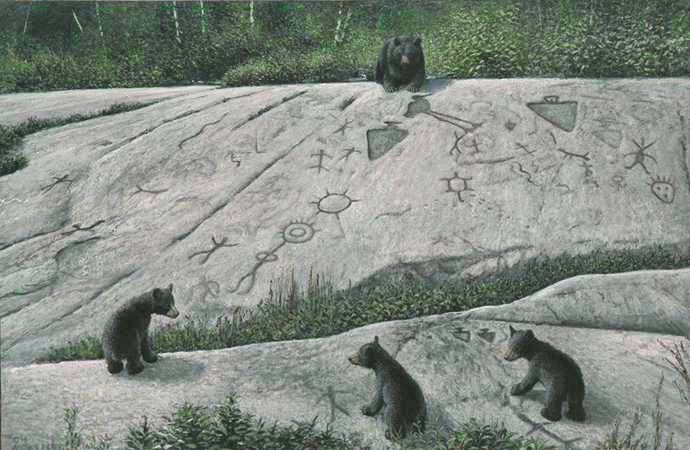 THE
TEACHING ROCKS - BLACK
BEARS 48"x32"
This
painting attempted to capture the original essence of these native rock
carvings near Peterborough Ontario Canada. All the details are
accurately located. This is not how they look today. Today they are in
a park and covered by a glass and steel structure, turned into a museum
display for tourist visitors. That was certainly not its original
purpose. Originally those who came there came to express their
reverence to it and perhaps add a carving of their own to convey a
message to the site and its spirits.
Over the years I have experimented with making
giclee reproductions of small size using Epson computer printers
designed for making high quality long lasting photographs. Today it is
quite normal. I experimented with using the small printers with only an
8" width to print small prints, as well as making larger prints through
outputting two long strips each of half the image, and then butting
them together and mounting it. Making the seam invisible proves to be a
bit of a challenge. If I were to begin marketing large size prints
again, the wiser approach is to purchase a wider Epson printer.
Prints are of greater
interest to those interested in making money from art. The artist is
not after money. Artists of any kind are in quest of audiences and
applause. To an artist selliing a painting is less important than a
person being moved. To an artist making a sale is a necessary evil from
the need to have at least to have food and a roof overhead. No wonder
that after my initial few years being an enterprising publisher and
marketer of my art when it was all the rage, my later excursions into
reproducing and selling art in print form have been driven mainly from
curiosity and expermentation, not from any making of money from them.
Still, reproductions are the only way the audience who lacks money, can
afford to possess the image that in original form can cost several
thousands of dollars because it took several weeks to create.
Therefore, I am still open to making extremely high quality prints if
the image is so good it is a shame only one buyer of the original can
enjoy it. My point is that my motivation in making reproductions is not
driven by money, but in increasing the audience. However, unless the
public expresses the demand for the images, I would far rather continue
to produce amazing works of art, than to get sidetracked in making
reproductions, unless there is something fascinating and creative in
doing so.
Maybe I'll get in the mood again to continue with
the limited editions.While creating art is mostly an end in itself,
selling art and prints is all business and the trick is to balance the
pure pursuit of art, with the need to make a living or at least pay for
expenses incurred.
2.2 SIGNIFICANT PAINTINGS HOPED FOR
LIMITED EDITION REPRODUCTION
Had I been wealthy - such as winning a lottery - I
would have published more of the serious paintings into limited edition
offset litho signed reproductions.
However, who could have anticipated the initial
public thirst for quality illustrative images affordably available in
limited edition prints would diminish. Even if we anticipated the
public filling up its walls and getting used to this new phenomenon,
there was also the rapid change in technology - not just the
development of the 'giclee' printing method, a high quality development
from inkjet technology, but digital photography and inkjet printing of
photographs, generally altered the way the public viewed images. If
anyone could make thousands of digital photos and print the best ones
out on their computer printers, then prints of any kind lost their
lustre. In addition there was the advent of the high definition flat
panel tv. Tradiional prints, even original art, was and is gradually
becoming 'antique' - something out of the past. Today, the art
collector who purchases original art of a traditional realistic nature,
is analogous to the wealthy person who buys valuable antiques, instead
of similar manufactured furniture, etc There is the value in having a
one-of-a-kind item out of the past, something hand-made by humans
instead of made my machines.
Some artists have experimented with putting images of
illustrative art on large flat high definition screens as a substitute
for the traditional framed art. The same screen can change the images
in slide-show fashion. However it does not work. There is something
appealing in a)an image painted by hand where the paint strokes are
visible, and b)the paper or canvas that carries the image. The same
applies to books - in spite of there being digital books today,
everyone acknowledges there is a good feeling in actually handling a
physical book, and if a person becomes fond of a book, they will still
get a physical book. I think that is also the appeal of a physical
painting or print. That is good news, because it means original art and
printed art still has an attraction.
Had the conditions of the late 1980's continued, I
would have
continued to create prints and market them. If I had continued to make
prints, the following section presents some of the wildlife paintings
that I would have tried to make into prints (and I can still do so, if
I find an interest in doing so. As above, if the painting I show is
available in the original I will put a black border around the image.
If there is no black border it means it is sold and not available from
me.
As desirable as it might have been to keep making
limited editions to market, realistically I would have needed to have
quite an art publishing business going. It would have taken me away
from my primary role of CREATING the art. It was also risky since one
could not predict how the public would react. In those days it was not
possible fo create prints individually via computer controlled inkjet
printing on high quality paper with high quality inks. Called 'giclee'
this approach was available towards the end of the 1990's. By the
giclee printing approach, artists could print only a handful at a time,
and then use the income from their sale to print more. Instead of
printing the entire edition in one large print run costing as much as
$5000 or even more, the artist could begin with a handful for $500. If
the same printer and paper was used in further printing, those further
prints would be identical to the first one.
My obstacle with continuing making prints from my
more serious paintings was and is not in creating the art or even
getting prints made - the problem is in the marketing and distribution
necessary, particularly with prints. I mentioned the book publishing
industry above - well anyone can today write a book and get it
published in digital form and even a few thousand hard copies. But they
wind up with a stack of several thousand books in the closet and now
they have to publicize it and distribute it. An established book
publisher already has their marketing machinery and distribution
system. Therefore, unless I have time and interest in doing marketing
and distribution to the degree required, making a limited edition
reproduction is satisfying, but then what do you do wth all the copies?
As the 1990's progressed, the distributors of limited edition prints,
mostly framing shops, closed one by one. Furthermore, the large players
in an industry push any independent small players away. I did not want
to play in that highly competitive world. Thus I finally decided that I
would sell limited edition prints alongside originals. The original art
world is insulated from aggressive large scale industries. (For the
simple reason that large scale industries deal with mass produced
products and original one-of-a-kind art exists outside the world of
'big business'.
In any event, here are some images of paintings that
I considered to be good candidates for limited edition prints, either
offset litho or giclee. Seeing some of these images, people have
asked me 'do you have a print of that?' The market is there, but,
as I say, managing the marketing of reproductions is an art in itself
that needs time and attention. I prefer to create art. I have never
liked the salesmanship side of it - even the salesmanship connected
with dealing with art galleries. For that reason, much more of my art
is still available than had I been much more interested in the
salesmanship side.
ORIGINAL IS
AVAILABLE FOR PURCHASE

MISTY
MARSH MOOSE 42" X 24" ARTIST HAS KEPT ORIGINAL,
BUT IT IS AVAILABLE ($3700)
This
painting, already shows above was one that I really wanted to make into
a limited edition print. What held me back was that interest in a
painting portraying a moose is too small. For purely business reasons,
I had to choose images that had a high probability of being popular and
selling enough to cover the many thousands of dollars in the cost of
printing it. With to coming of the giclee approach, the intial costs
are small since it can be made one at a time, and it is less risky. I
may still consider doing that.
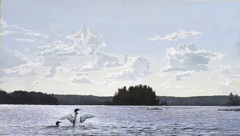
CLOUDDANCE 28"x16"
After
my success with 'Summer Sympony Loons' print, I painted this as a 'part
two' of that success. It was painted in exactly the same size as the
original of 'Summer Symphony-Loons' and I envisioned it being printed
in exactly the same size and similar paper. But this plan has not gone
anywhere. The reason is largely as I say in the text, that I became
weary of the 'buiness side' of limited edition prints.
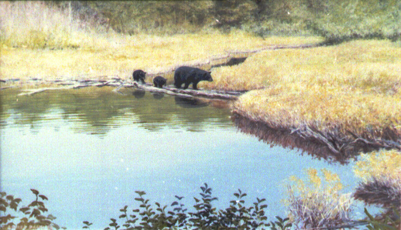
BEAR FAMILY CROSSING LOGS
I
may think this is a charming image because it is a real place. When I
was a boy, our family crossed those logs to get to a ridge where we
picked blueberries. Since black berries like blueberries too, I
imagined a mother bear could take her cubs to a familiar place.
(Although, technically, by the time blueberries are ripe, the cubs
should be a little larger, I guess.)
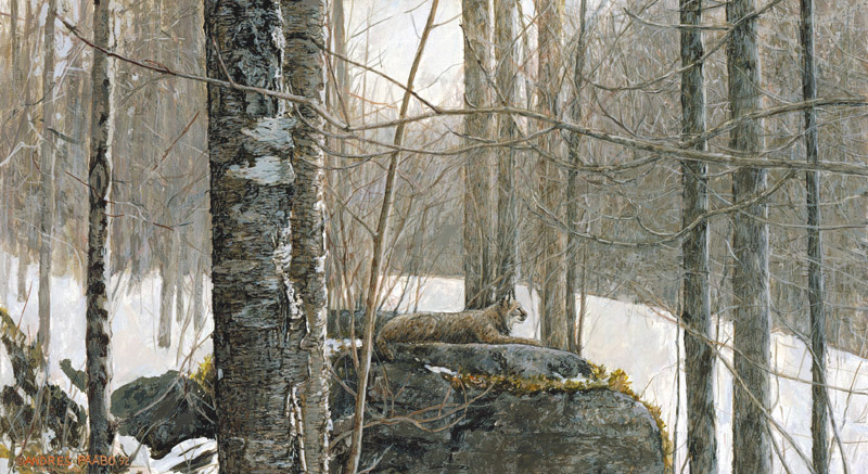
BOBCAT ON ROCK LEDGE 28" x14"
This
painting pleased me greatly, and I always saw it as a good candidate
for a limited edition print. I have experimented with small versions of
the image, and continue to be itching to see it as a print made in very
limited quanitity via the giclee process.
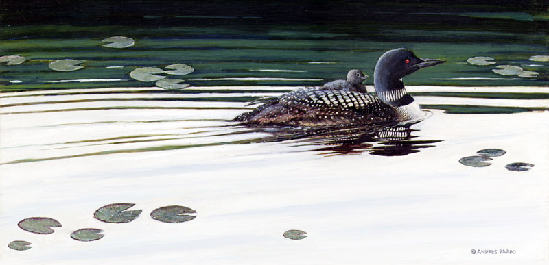
LOONYBACKING 24" x14"
I
have always seen this image as a good one for a smaller size print, and
I even managed to myself print inkjet versions on a computer printer,
only 8" tall but long and narrow. If I set up at art shows -which I
haven't done for some time - it will be a sure seller.
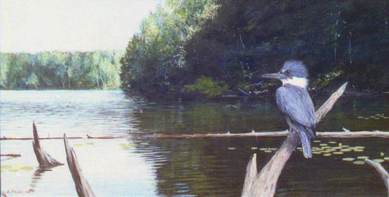
KINGFISHER BAY 28" x 14"
Although
the kingfisher is not as attractive as a loon, I can easily see a print
with this image in a smaller size, as a companion to the Loonybacking
painting above.
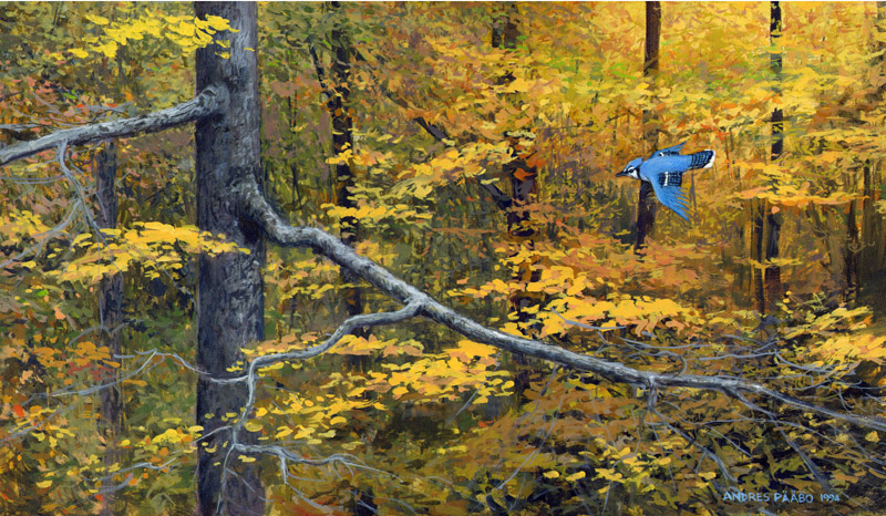
FLASH OF BLUE about 24"x14"
Flash
of Blue is a
design on the abstract level, designed so that it can have a layer of
nature's reality on top of it. The blue of the bluejay is used like a
blue dot on a yellow field. I have created some amazing reproductions
of this via the inkjet method. This is another image that is on my
wishlist of reproducing. I have experimented with some small inkjet
reproductions, but it needs a medium size meaning a larger giclee
inkjet printer.
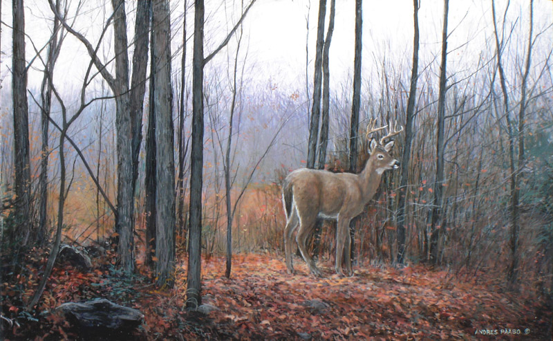
AUTUMN CLEARING about 30" x 20"
This
painting image is another one that I would like to see in a print of
medium size, but after getting some of the above printed.
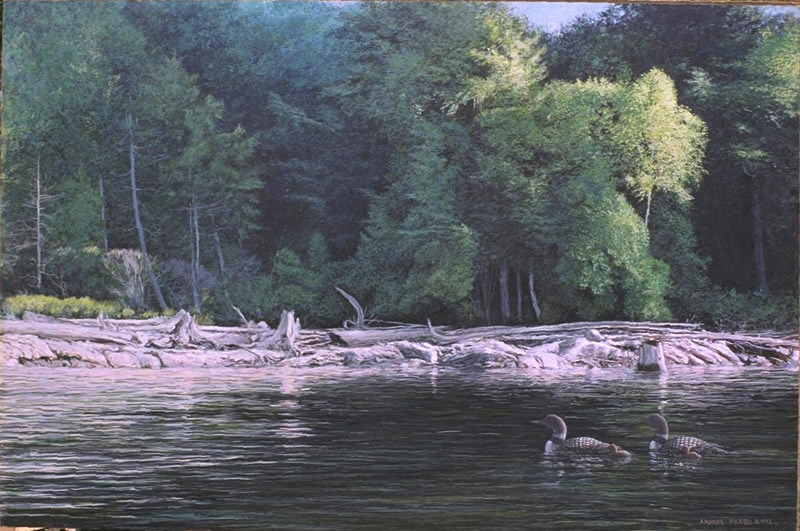
DRIFTWOOD SHORE 32" x 48"
This
painting was inspired by the great success of 'Wild Shore-Loons' as it
has similarities. It would have been nice to print this image, but a
little smaller than 'Wild Shore-Loons'
Assorted Further
Wildlife Paintings That Contain Interesting Features
The following paintings are ones that I was inspired
to paint. Some of them could look good reproduced, but the business
side of reproduction has to address the question of 'how broad appeal
is there for the image?' As I discuss above, it is all a marketing
problem. While the first one below of the arctic wolves might be
attractive to lovers of wolves or with experience with the arctic, the
challenge is to be able to find tose customers. Because that is
difficult it is easier to go with an image that is likely to
appeal to the largest population.
Because marketing is so difficult, I simply painted
images that in one way or other inspired ME, whether anyone liked it or
not. I add under the images below, some reasons behind the image.
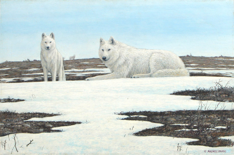
TUNDRA SPRING - ARCTIC WOLVES (ORIGINAL AVAILABLE)
 By
the time I painted this, I had
painted some scenes with very menacing looking timber wolves. When I
saw picturs of white arctic wolves, I saw them being very pretty, and
my experiment here was to see if I could paint a sunny arctic summer
portrait of arctic wolves that was actually very pleasant

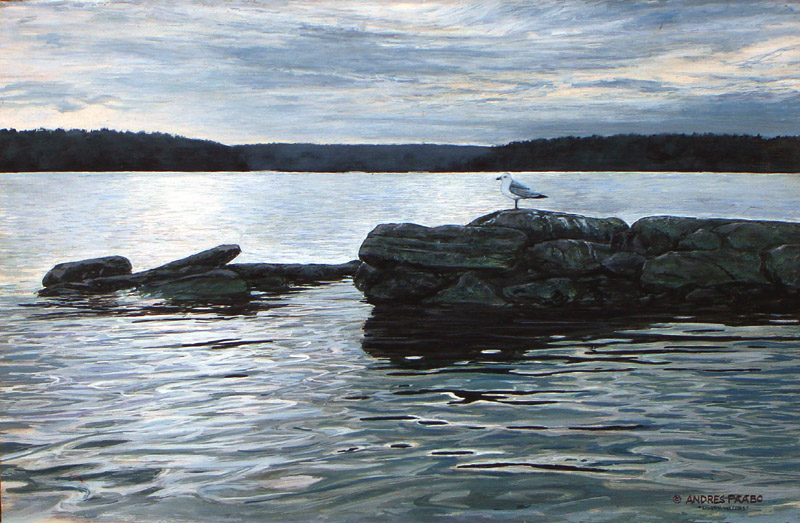
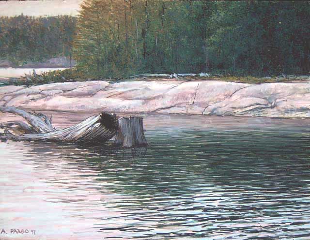
SILVERY WATERS (ORIGINAL AVAILABLE)

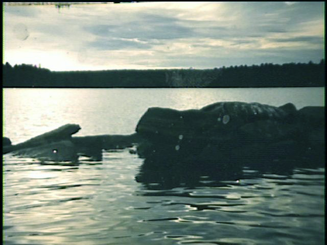 I evperienced this scene on my lake
one dusk and took photos to capture the very interesting water in the
foreground. Since the rock was stained by bird excrement, I added the
seagull
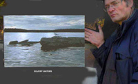
(lEFT) PHOTO OF SCENE SHOWS HOW MUCH THE ARTIST CAN IMPROVE A
SCENE (I ADDED COLOURS THE CAMERA FILM CANNOT CAPTURE AT THIS LOW LIGHT
AND BALANCES ELEMENTS LEFT AND RIGHT, STRAIGHTENED LINES, ETC

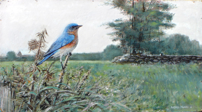
BLUEBIRD (ORIGINAL AVAILABLE)
This painting aimed to be a portrait
of a bluebird in its natural habitat. It was an interesting painting in
that when I came to painting the grasses and weeds in the foreground I
decided to make it very impressionistic to add some feeling to the
scene - a sense of the grasses rustling, etc.

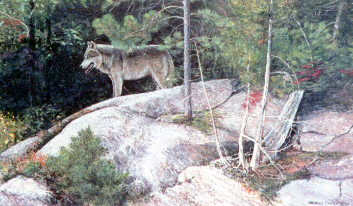
WOLF VANTAGE POINT
This
painting was a study of a granite ridge with its various elements. It
seemed a little empty so I saw a way to place a wolf into the design.

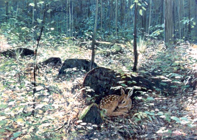
FAWN (ANOTHER VERSION OF THIS DESIGN IS AVAILABLE)
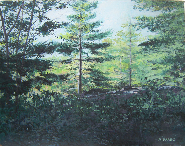
This
painting builds upon sunlight
falling onto a forest floor, I explored earlier, but alters it and
creates a narrative with the fawn hidden behind a rock. This is a great
painting that also uses impressionistic techniques to capture the
feeling of the situation.

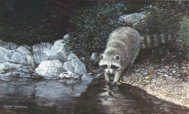
RACCOON BY THE SHORE
In
this case I had the scene that
combines water, rock, sand, foliage. I added the racoon to complete the
interraction of textures.

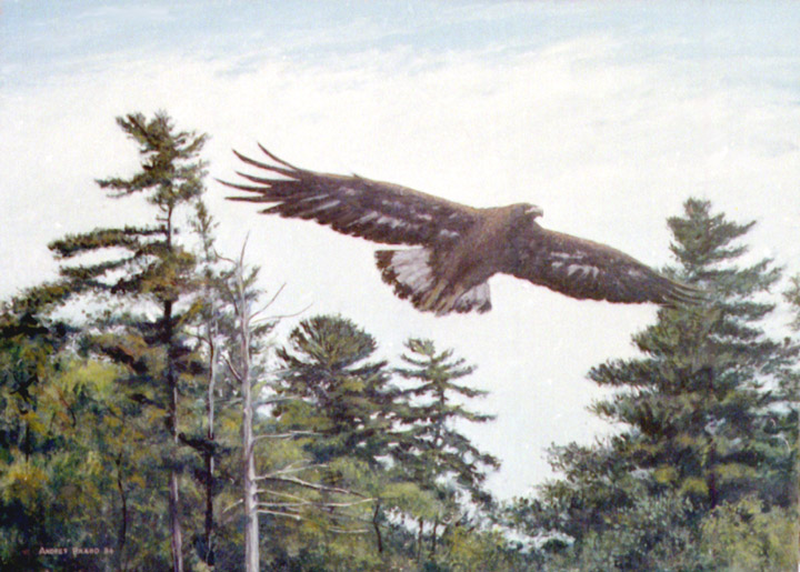
GOLDEN EAGLE
I
was fascinated by the variety of
windswept pines at Burleigh Falls Ontario. I saw in my mind's eye how I
could put a goldern eagle into the scene so that it integrated with the
narrative of the background.
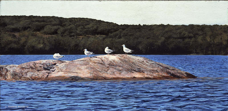
SEAGULL: ROCK
This
portrays an actual rock where
seagulls liked to perch.In truth this painting is dominated by the
abstract design and the gulls and rock are veneer on top of an abstract
design.
2.3 SOME PAINTINGS WHERE THE FOCAL
POINT IS SOMETHING OTHER THAN AN ANIMAL
Adding 'Animals' to
Landscapes Changed How it Was Viewed
The last section dealing with my beginnings,
you saw
that in my early years I found that small quickly painted landscape
paintings were very popular In the early 1980's I created some
paintings in larger size and greater detail, expecting that larger
landscapes could bring in more income. I managed to sell some, but
after 1985 I realized the small quarters in which most people lived
produced a greater demand for smaller landscapes. I then made the size
12"x16" my standard size.
My purpose was, as I explained above, wildlife art
as it was defined in the world of limited editions. In that world,
there was a naturalist perspective, which was not about emotions like
in the Group of Seven impressionistic traditions, but about exploring
details, descibing, portraying nature as it exists - not merely the
emotional colour of nature. Accordingly my scheme became one of
pursuing a detailed realistic landscape, and incorporating an animal in
it. You can see this in the above wildlife paintings. They are not
portraits of animals, nor portaits of landscapes,but portraits of
animals in environments. They are naturalist-environmentalist in
character.
Thus, the 70's-80's trends in wildlife art, or
rather
naturalist art, inspired ultimately by Robert Bateman's images,
encouraged me to render my landscape paintings in more detail. In the
above wildlife paintings note the one called "Heron Rookery" where the
wildlife presence is like a dot in an abstract painting. Without the
heron, it would still have been an intriguing portrait of a marsh,
capturing all its textures and details. With the heron, it - mostly
subjectively - adds a wildlife presence, which is true to nature.
Nowhere do you find a wilderness landscape without some presence of an
animal, at least a bird singing.
In those days, I would have liked to add an animal,
however lightly, to every such detailed landscape, to add that
naturalist-environmentalist dimension. But I realized often it was not
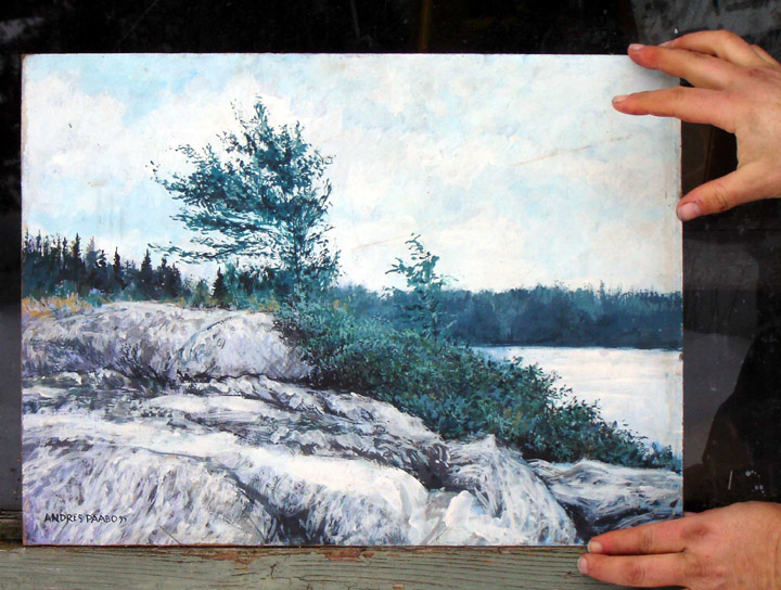
necessary. For example, in the following painting, the focus, the
animal presence, is the wind-blown tree.

This
painting is actually a 'wildlife painting' because it uses the same
technique as having an animal in a landscape. In this case the tree is
the feature animal, and the viwer is asked to consider the relationship
between the tree and its windy cliffside environment.
That is my 'animal'. If a landscape has a notable
feature that can be a
focal point, adding another focal point may be counterproductive. The
painting can work without an animal, if there is an alternative focal
point. This would be the case if a landcape painting included a barn, a
wooden trailer, etc. As I mentioned, when there is an animal in a
landscape, then the narrative is about the relationship of that animal
to the landscape. Similarly if there is a house in a landscape, then
the narrative is about the relationship of that house to its
surrounding landscape. Even though it is technically living, a house, a
trailer, a tree on a cliff, etc are assigned a spirit, a livingness, a
context, a narrative. Thus technically many of my landscape paintings
became wildlife paintings purely from there being an animated focal
point. The following painting is a good example - the 'animal' is the
house. Compare that with the Heron Rookery, where the animal is a small
shadow, but is important because the viewer knows it is there.

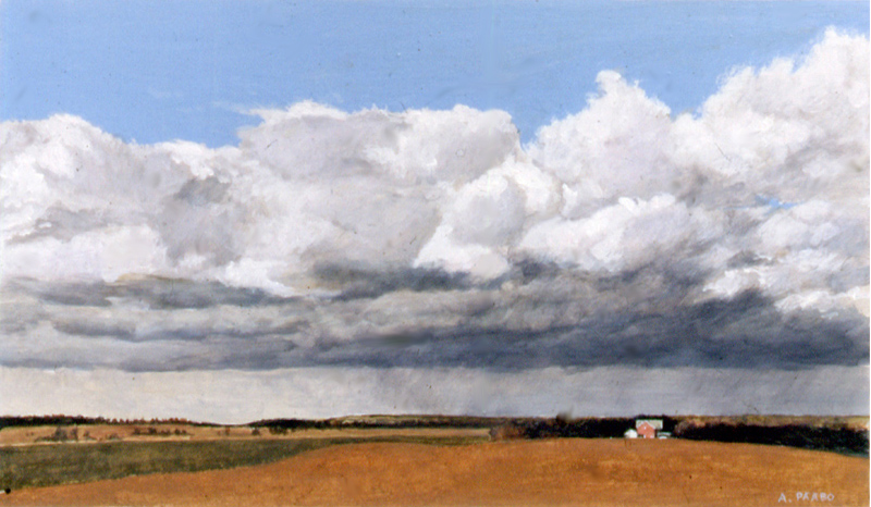
RAIN CLOUDS
See
text. This is another good example in which the focal point in the
landscape is not an animal but the house. Like my landcapes with an
animal in it, where we observe the relationship between the animal and
its environment, here we observe the relationship between the house and
the surrounding countryside. If that house is not in the painting, we
still have the nice landscape but we do not have the implied narrative,
the story about the farmhouse in a farming landscape. This this
painting is no different in principle than my wildlife paintings.

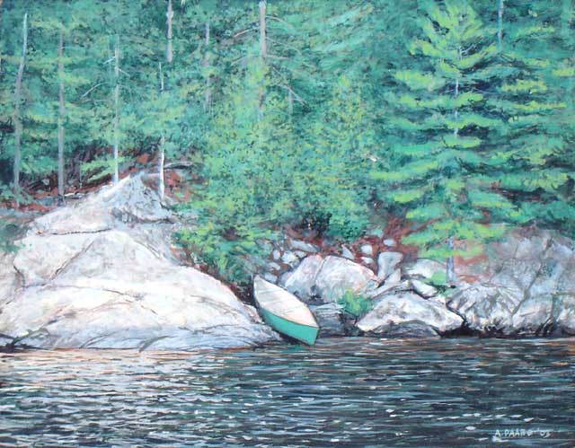
GREEN CANOE
In
this painting. the canoe is the focal point, the 'animal' in this
wildlife painting, that creates the narrative and relationship to the
environment

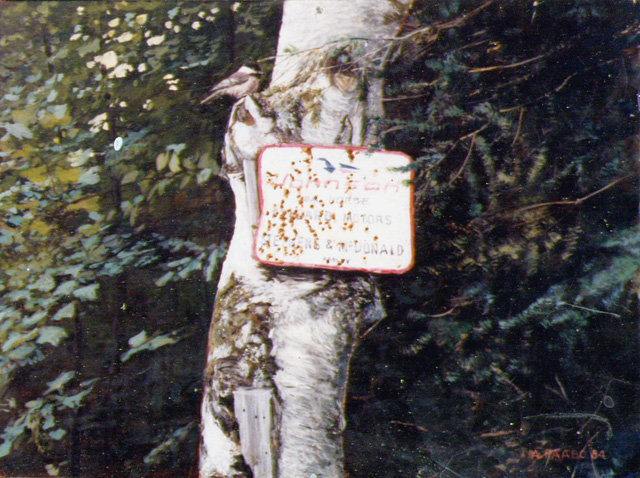
THE OLD SIGN 16" x 12"
This
was an actual sign on a tree.
Adding a chickadee seemed to add an additional dimension to the
narrative
It is interesting to note that most of l my wildlife art
is like this. The strength of the landscape versus the animated focal
point varies. In some painting the landscape is so strong that if we
remove the focal point, the 'animal', it stands fine as a landscape
painting. In other cases like the "Tundra Spring' white wolves painting
above, the portrayal of the white wolves dominates. If we remove these
wolves we don't really have much to feast our eyes upon. And in the
extreme, I will create a true landscape painting (where the narrative
is the relationship between the viewer and the scene only) or a full
animal portrait.
The following gives some more examples of paintings
in which the role of the animal or focal point, and the surrounding
environment have an equal role, especially if I show and interraction
between animal and environment
SINCE 1985 - SOME SCENES IN WHICH ANIMALS AND ENVIRONMENTS HAVE EQUAL
VALUE
Focussing on the animal works best if the artist is
very familiar with the animal, such as a chipmunk he always sees
around. It is like in portraying people - you strive to capture the
character of the subject, and that is only possible if you become
familiar with it. Otherwise we see animals at a distance doing things
in the environment. The following paintings reflect the reality that I
saw animals behaving at a medium distance, and that is what I
portrayed. If the ideal is to paint what you experience and know,. some
of my closeup portraits of animals are a bit deficient. Most of the
time I experienced animals from a distance, and that is mostly what is
shown below in these examples.
2.3 PAINTINGS FEATURING PORTRAITS OF
ANIMALS
While my greatest
interest
was in the environment, and I tended to paint landscapes and bringing
animals into the scene in natural ways (since all environments contain
wildlife of some kind), sometimes I became especially inerested in a
particular animal, notably an animal in my environment that I had
studied a great deal - a squirrel, chipmunk, bird, etc.
I am not the same as some wildlife artists who are
interested in
wildlife first of all. For example Robert Bateman became a bird watcher
and loved to paint birds. In my childhood I did paint and sketch a few
animals I actually experienced - such as I did a pastel sketch of a
kestrel on a telephone line, with the help of binoculars - but my
interests did not steer in that direction, but towads people portraits
and landscapes.
In the years of being a wildlife artist, I did focus
sometimes more
on the animal than its environment, creating actual portraits of the
animal rather than the entire environment. The following are some
examples
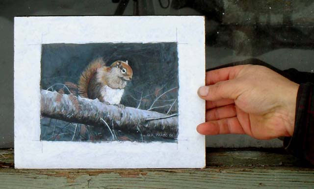
 "REDBACK" PORTRAIT
This is a portrait of a visitor to my
property one winter. I learned that winter animals actually appreciate
the presence of another creature during the desolation of wintertime.
Portraits are best when they are of an actual individual. The snowshoe
hare paintings below are also of visitors to my property and are
genuine portraits.
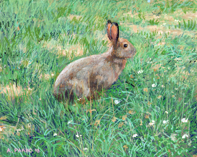
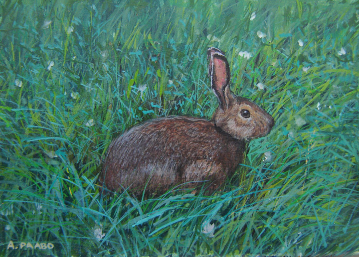
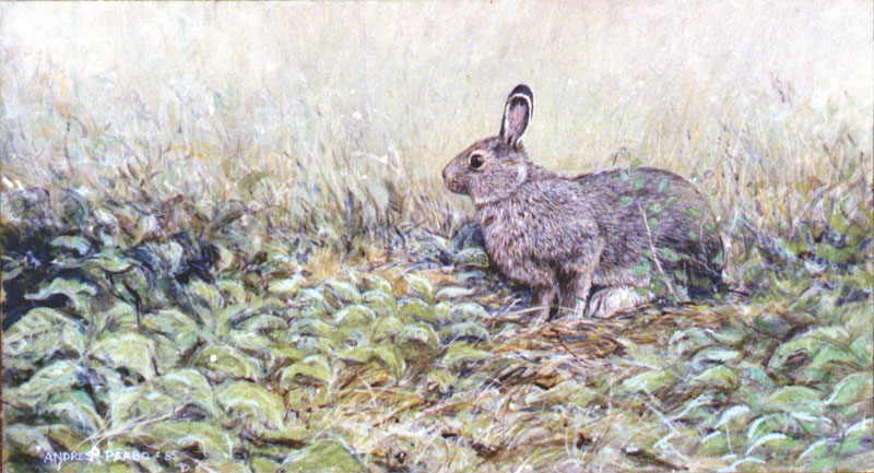
A COUPLE OF PORTRAITS OF A SUMMER
VISITOR TO MY GRASSES- SNOWSHOE HARE


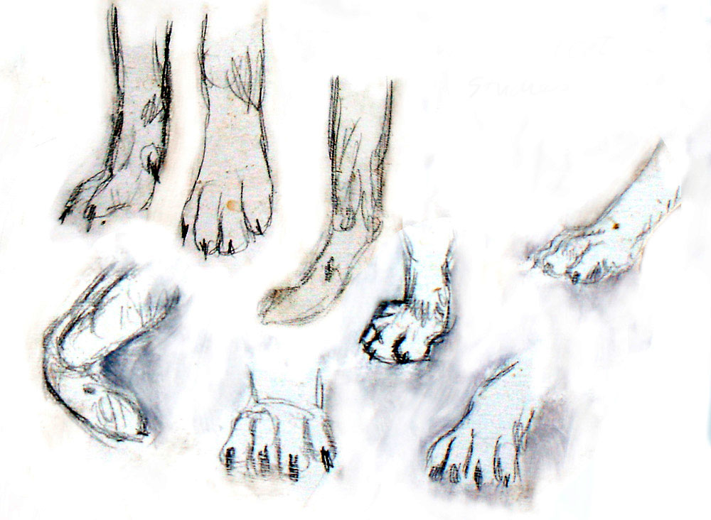
I did many sketches and paintings of
the snowshoe hare because they often came out of the grassless forest
to feed on my grass and clover
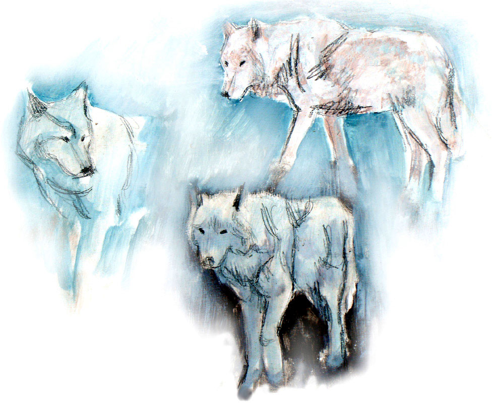
A COUPLE OF STUDIES OF ARCTIC WOLVES


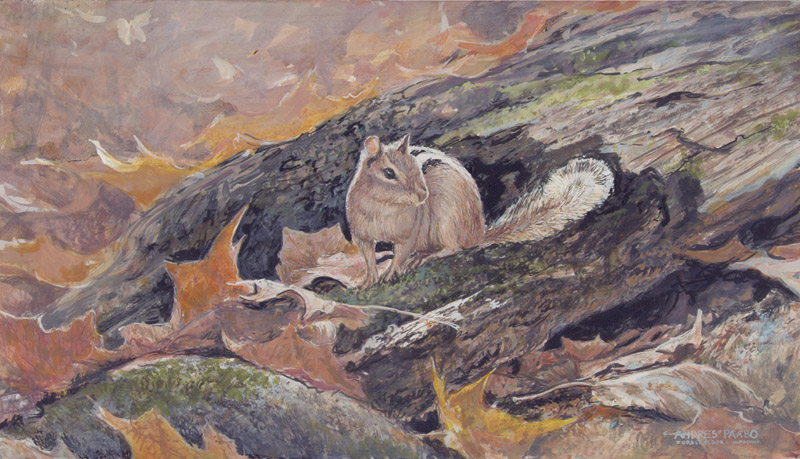
 FOREST FLOOR CHIPMUNK
A
portrait comes out best if the artist has plenty of experience with
an animal. In this case these kinds of chipmunks, ground squirrels, are
common, and can be seen often scampering aroung on the forest
floor.
I regard this as a portrait because the chipmunk is not removable from
its surroundings
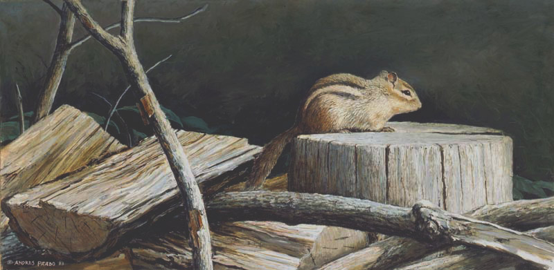
 SUNNING ON THE WOODPILE
I
woke up one spring morning and found a chipmunk laying on a woodpile
like this with no other reason than to enjoy the warmth of the sun. It
proves that chipmunks are not all about scampering around looking for
food, but have a 'recreational life' too.
This is also a portrait of a rural woodpile so it is a little more than
a portrait.
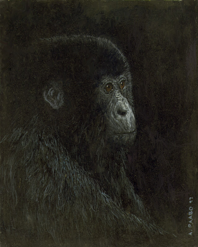
 JUVENILE GORILLA - A SMALL PAINTING OF 8"x10"
I never knew a juvenile gorilla
personally, but I was fascinated by gorillas - one of humankind's close
relatives - and some pictures in a magazine showed how much a juvenile
gorilla shows human characteristics. For fun and experiment in the use
of lighting, I decided to make a portrait. If it interests you, I think
it is around here somewhere...
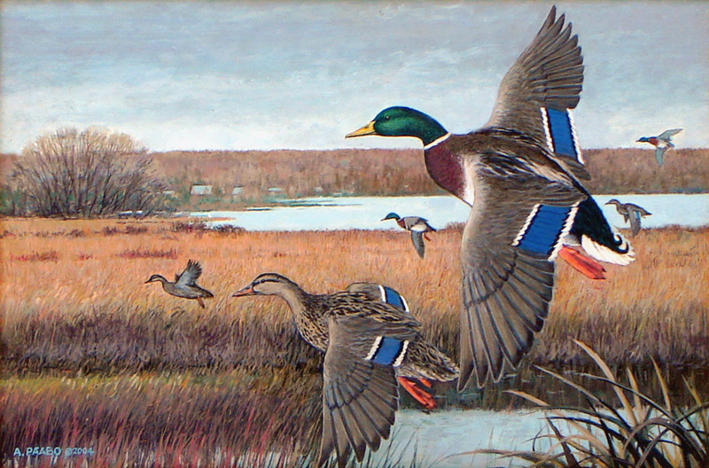
 MALLARDS IN FLIGHT
This
is one of three paintings that I painted over the years as submissions
to the stamp competition by Habitat Canada. This, I was told, was a
finalist. The other painting that I submitted a few years later of
White Throated Goose is shown here in a previous section. These
paintings attemmpted to follow the tradition of portraying animals, in
which the purpose is to describe the animal in its habitat. I actually
don' t prefer it, because it is coldly descriptive. As my other art
shows, I like to be expressive with the brush - to capture some
emotion. I am not a technician.
Unlike some other wildlife artists, I do not like
painting what I do not understand very well. When I add animals into
landscapes, I am reflecting my experience seeing the animals from a
little distance. There are other wildlife artists who indulge in
studying animals up close. They watch them with binoculars, study them
up close when stuffed and reconstructed (often artists, on
finding a dead bird will put them in a freezer to use later). I do not
like treating animals like objects. I prefer to see them alive in their
natural habitat. Whenever I have departed from this perspective and
made a painting of an animal I know little about, the result is never
as inspired as if I know the animal from direct experience.
SEE PART 4 FOR MORE PORTRAITS OF
ANIMALS
2.4 SOME
LANDSCAPES DURING THIS PERIOD (1985-1995)
I have always approached art with animals from the
environment-inward. My method has been always to paint the landscape
and imagine what animal would naturally be found in the scene, and
where. Sometimes adding an animal seemed not necessary or
counterproductive, so I didn't. For example 'Pink Rock' below could
have a seagull in it, but it would not add anything so it was a tossup
whether to add one or not.
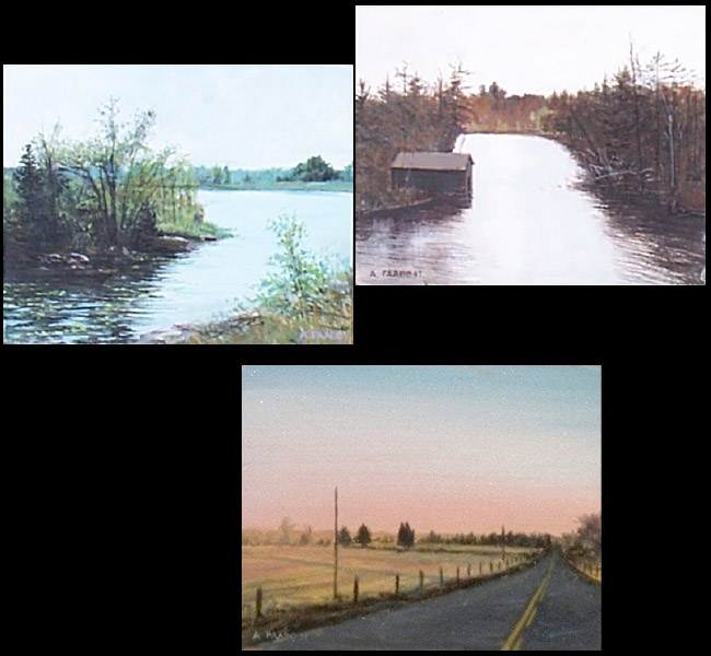
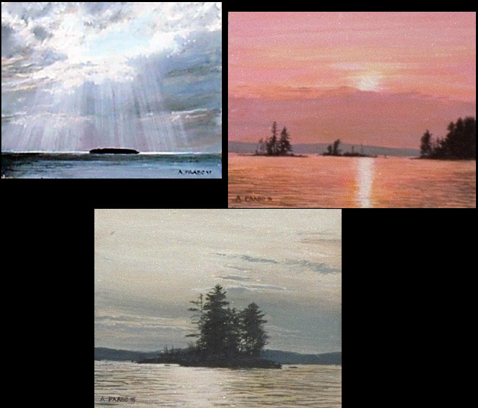
In this section I show landscapes which remained
landscapes from the simple reason that I did not envision an animal in
it. As I said earlier, if a landscape painting has no focal point
object or animal, then the viewer relates to the image directly. An
animal or other object in a scene means the viewer has to interract
with that object or object. It changes the narrative. Here is a
selection of developed landscape paintings that do not include an
animal, or if they do, the animal has no role and is not noticable.
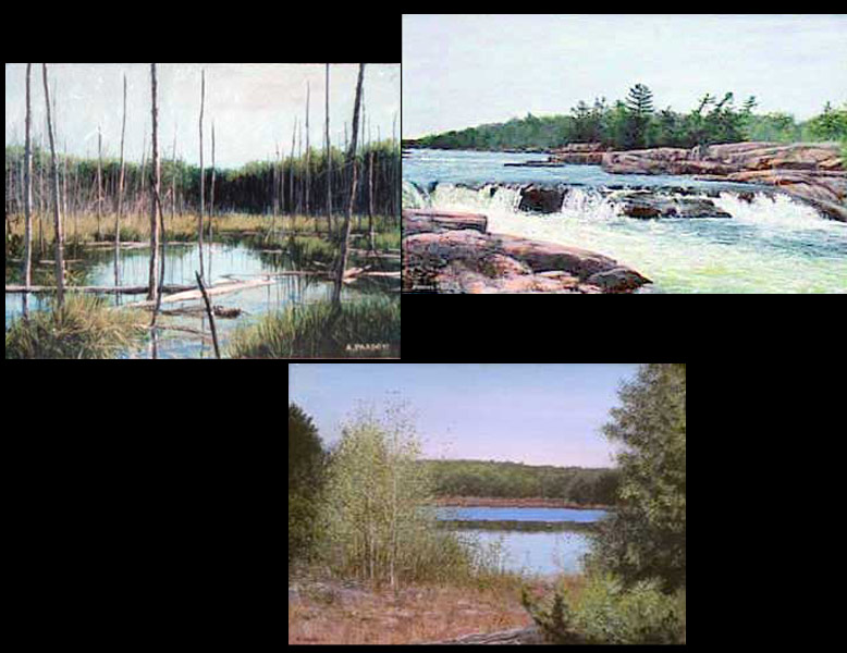
The following range from large landscapes at the
top, to smaller landscapes on 16" x 12" or smaller.
 "SPRING RUNOFF" (about 20" x 14")
This
does not look like a landscape.
It is a closeup of nature that a person might encounter in the
wilderness. Success in the art depends on finding the underlying
abstract design and symbolism
 PINK ROCK 20" x 16"
Underlying
every painting, whether it
is impressionistic or descriptive, there is an abstract design of
colours, textures, shapes, etc. I saw in this scene a design
underneath, and also symbolism in the descriptive veneer on top.

THE OPPOSITE SHORE
This
painting is done of the shore opposite me. It is the same shore as
found in the childhood painting showing the deer at the water. My
intention was to paint it very emotionally so as to make the shore very
exciting. This illustrates what the artist can do. A photo of this
scene is unable to capture any emotional reaction.
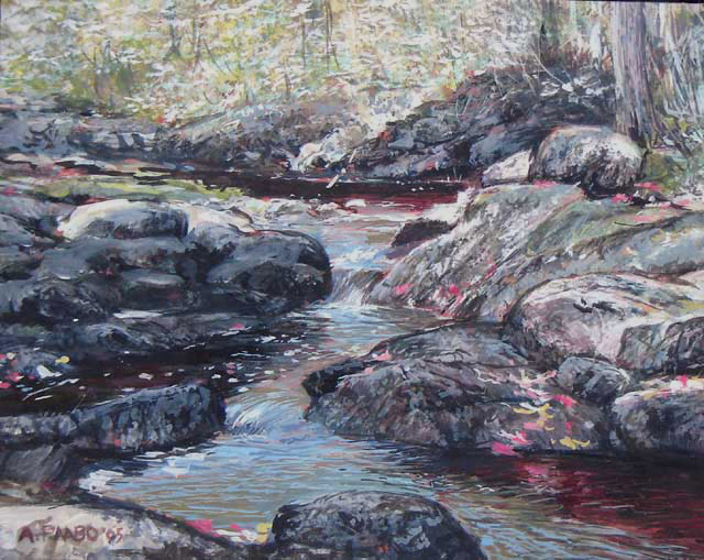
 CLANRICARDE CREEK 16" x 12"
I was attracted to this scene because of the variety of elements -
rocks, water, trees, sunlight speckled with red fall leaves
 BON ECHO MORNING
Participating
in an art show at Bon Echo Provincial Park, I went for a hike early the
second morning and was moved by the morning sun shining through the
trees. This painting attempts to capture the feeling of morning light.
GREEN BORDER INDICATES THIS PAINTING IS
AVAILABLE
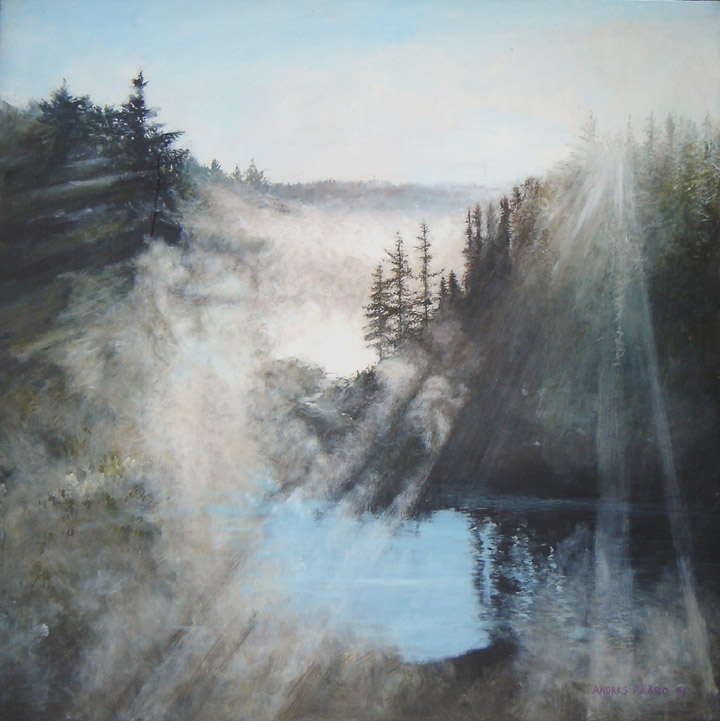
 TEMAGAMI SUNRISE LARGE PAINTING 40" x 40"
Returning
in the early morning from an art show at Temagami Ontario, I saw a
scene to my left in the direction of the rising sun, stopped my car,
and walked back with my camera and took some photographs. Later I was
inspired to try to develop what I saw into a large painting. This is
very large (40"x40"), and still available. Contact me if you have and
interest, as with any painting shown with an image with a green border.
Despite its large size it is not painting in sharp detail. My price
would be around $2000
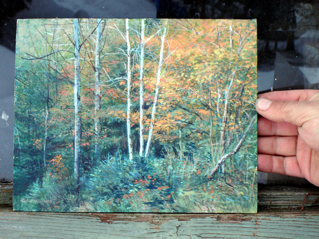
2.5 MY TRADITION OF SMALL 8"x10" LANDSCAPE PAINTINGS THROUGH
1985-1995
Nature Realism That
Never Loses its Appeal
In the early 1900's the Group of Seven artists
proved that in spite of the art establishment sneering at art using
wilderenss as subject matter, the general public loved it - and for the
same reason the public liked to vacation in the wilderness to camp,
fish, canoe, etc. The images produced by the Group of Seven
artists, and Tom Thomson, captured the feelings of the wilderness that
the public understood, while the snobbish urban art experts - who
probably never went into the outdoors - could not understand why art
should look at wilderness. Even the French impressionists never painted
wilderness. The reason for this is obvious. There was and is no
wilderness in Europe! There is wilderness in northern
Scandinavia, and there were some artists painting the wilderenss there
- so it is a matter of what the public is familiar with and wanting to
celebrate in art.
Make no mistake about it - as I already said in the
previous section - impressionism is still about portraying the subject
matter. It only portrays the emotional side of it.
Although I explored impressionism - painting so as
to convey the emotional side of the subject matter - I am an
intellectual person too, and I always wanted to have more detail, more
narrative: Thus the kind of landscape painting I pursued - as you will
see here - was quite faithful to the details, to the three dimensional
space, of the subject matter, but I also took the opportunity of using
technique to convey impressions like the fluidity of water, the
roughness of rock, the fluffiness of cloud.
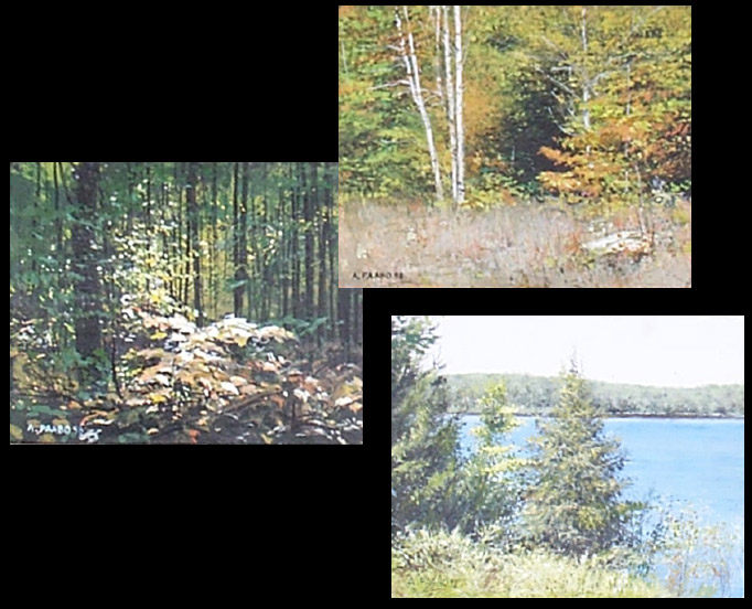
The following paintings are landcapes without any
animal. What is the difference between a landcape with an animal and a
regular landscape without an animal. The answer is simple. When the
landscape has no animal, the viewer interprets it as if they are hiking
through nature and experiencing it. When an animal is added, that
animal is experiencing the landscape, and we the viewer are not
directly experiencing the landscape but observing the animal relating
to nature. The former is an outdoor recreationist perspective, the
latter is a naturalist perspective. As I said above the Group of Seven
paintings appealed to human direct experience with nature. That
perspective will never die as long as humans experience nature, whereas
interest in animals can increase and decrease according the degree to
which society is naturalistically inclined.
SEE NEXT CHAPTER
DEVOTED TO LANDSCAPES FOR MORE IMAGES OF SMALL PAINTINGS IN LARGER SIZE
The above section is an overview of the
period during which I became a full time professional artist in the new
world of wildlife art, environmental illustration, and limited edition
reproductions. By mid 1990's the pubic interest in these forms of art
levelled off, and I was happy to diversify in order to take the
pressure off making a living entirely on art. Having had past
experience in graphic commercial art, I easily adopted to the internet,
learning website creation in the late 1990's when it was very new, and
making some of my living from website design in the next period
1995-2005 described in the next section
The
above was written
in april 2016 - Andres P��bo
contact: A.Paabo, Box 478,
Apsley, Ont., Canada
2016 (c) A. P��bo.


 This
was my first major project after
I committed myself to being a widlife artist fulltime for a living. I
recall how I painted it in fall-winter of 1985 and then attempted to
use a router to make a frame for it from 2by4's This was one that
I
wanted to reproduce in print form and add it to my collection of
limited edition prints. However, the moose is not a widely appealing
subject, and I held back on making a limited edition from it. I have
kept the original. The original is available for several thousand, or a
print can be made individually to order for a fraction of the original
by the new inkjet process called 'giclee' Call 705-656-9487 if you have
questions about this one.
 BALANCE OF NATURE 42"
x 22" 1983 WAS REPRODUCED AS L.E. PRINT (SOME
AVAILABLE)

 ICE
FREE WATERS- BOBCAT 30" x 20"
ALSO REPRODUCED AS LIMITED
EDITION OF 500 S/N (A FEW AVAILABLE)

 After I had my
first limited editions, I was very inspired, and tackled this
masterpiece image based on my experiences deep in Alder Bay, including
seeing loons and young. The original sold for
$6000, prints for $150. The purchaser of the original traded it back to
me for the same size Autumn
Cascade original; hence I have the original, and plan to include it in
a future one-man show.

 This
painting was inspired by a cluster of maples that had grown together
into one tree. I of course simplified and designed the branches. In and
around the branches I added some winder animals - the bluejay, the
squirrel, and the deer. The tree is a symbol of how trees embrace and
shelter animals in its midst. The print has been a favourite one for
women.

 THE
TEACHING ROCKS - BLACK
BEARS 48"x32"


 By
the time I painted this, I had
painted some scenes with very menacing looking timber wolves. When I
saw picturs of white arctic wolves, I saw them being very pretty, and
my experiment here was to see if I could paint a sunny arctic summer
portrait of arctic wolves that was actually very pleasant